_edited_edited.png)
(Image by Author)
Introduction-
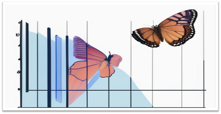
What is a Butterfly Chart?
A butterfly chart also called Tornado or Divergent chart in Tableau is a kind of bar chart used to compare two different metrics and two data sets at a time. This chart plots the data as two horizontal bars with the same X-axis in the center. They are so named because the final chart visually resembles either one half or a complete butterfly. So we need the reverse the bar chart of one side to make it look like a butterfly.
Butterfly diagrams, also called butterfly plots or butterfly charts, are a special type of Bar chart, where the data categories are listed vertically instead of the standard horizontal presentation, and the categories are ordered so that the largest bar appears at the top of the chart, the second largest appears second from the top, and so on.
Use Cases:
It is useful when you are comparing something like the population of a Country, State, or City. Say for the male gender population, and the female gender population of the Country, Comparing the previous year's sales and the current year's sales for the same product as well as for two different products, comparing the profit of two different companies in a single year.
Let’s dive deep into making a beautiful Butterfly Chart.
Problem Statement-
‘Rate of male employees vs female employees in different job roles in the company"
Dataset: HR Data
Let's start by loading the Sample HR Dataset into Tableau and following the given steps on the new Sheet.
Step 1: Select Job Role (Dimensions) and put it in the rows field.

(image by author)
Step 2: Create two calculated fields one is for the "Rate of Male Employees" and the other one is "Rate of female Employees".

(image by author)

(Image by Author)
Step 3:Select the Rate of Male and Rate of Female calculated fields and put them into columns.

(Image by author)
Step -4: Create one more calculated field called zero axes and just give it a value ‘0’ and after creating it we will put it into the middle of the two existing column names in the chart. So that the Job role names will be displayed in the middle.


(image by author)
Step 5: Now drag the Job role into 'label' under the Mark in the zero line so that the different names of the Job role will be displayed in the middle. As the various job roles are already displayed in the middle there is no need to display the header at the left-hand side. We can hide it by unchecking the show header option under the edit axis.

(image by author)
Step 6: As this is going to be a butterfly chart, we must work on the axis a little bit so changes the left one by changing it to reverse mode by clicking on the edit axis. Under scale, select reversed. So, the graph for the rate of Male Employees will be reversed in this case. Also, change the bar chart to text under the mark of the zero line. Quite lastly we will change the view to the entire view.

(image by author)
Step 7: As we are working on two different genders let's differentiate them by adding two different colors to the two different genders. Let’s choose Pink for Females and keep blue which is quite intuitive as it is for male employees and blue as it is for male employees. Also, add one more zero line to the columns for the female employees' rate and add job role to the label, and under mark change the bar graph to text.

(image by author)
Step 8: Now that we already know the left one is for males and the right one is for females, let’s change the description to male % and female %. Clean up, show up a little bit, and let’s choose none in the tick marks in case of both male and female.


Step 9: Step 9: let’s clean up the lines a little bit so that the lines will not be visible in both zero-line graphs. When we go to the format side there, we will just make all the zero lines to none though it’s a quite tedious job.


(Image by Author)
Step 10: Now let's remove the names zero lines from the sheet by following the below steps.


(Image by Author)
Step 11: Also change the size of the text and also change the alignment of it in both the zero line and also fix the tooltips in both the charts of male and female employees.


(Image by Author)
Step 12: Now choose the dual axis in both the zero line graphs and also synchronize it .


(Image by Author)
Step 13: After converting it to dual axis, go to the edit axis of the left chart and change the range to fixed and give it the required range. Simultaneously go to the tick mark tab and change the range from none to fixed and give the interval. Meanwhile, go edit the axis, and change the axis format to the percentage for both charts by keeping the decimal place to 0.

(Image by Author)

Step 14: After few other formatting like changing the color of the job role (2) in and dragging the Job Role (Dimension) to the label under marks we will be able to see the below result.

(Image by Author)
Voila!
Findings: It is found that percentage of male employees is higher than the female in every job roles and for Human Resources it is most.
Conclusion:
This is the efficient, effective and easy way to compares two measures. Here I have done the comparison in between male and female employees percentage in the company.