_edited_edited.png)

Welcome, Readers! Today, we’re diving into the world of Sankey charts, a powerful visualization tool that helps illustrate the flow and relationships between variables. Sankey charts are particularly effective in displaying data with multiple dimensions, making it easier to understand complex datasets at a glance. If you haven’t yet read my previous blog discussing the prerequisites for creating Sankey charts, please take a moment to do so. Preparing your data correctly is essential before we embark on this journey.
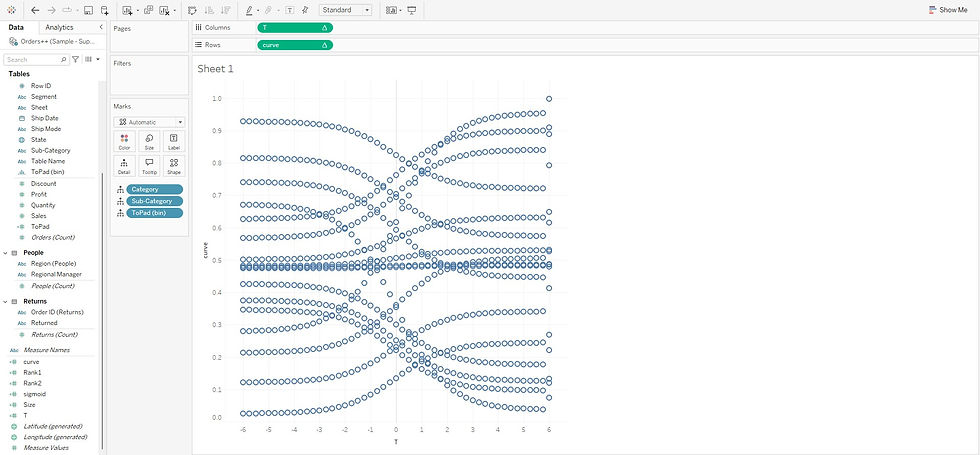
Steps for Creating a Sankey Chart
Put T in Columns: Start by dragging your T field to the Columns shelf.

Place Source Dimension in Detail: Add your Source dimension to the Detail shelf. This step will allow the chart to differentiate between the various sources.
Place Target Dimension in Detail: Similarly, add your Target dimension to the Detail shelf. This helps define the endpoints of your flows.
Put ToPad (bins) in Detail: Include the ToPad (bins) calculated field in Detail. This field is essential for smoothing out the curves.

Put Curve in Rows: Next, place the Curve field in the Rows shelf. This field will create the flow lines in your chart.

Edit Table Calculation of the Curve in the Row Shelf: Click on the Curve field in the Rows shelf. Select “Edit Table Calculation” and choose Special Dimensions for Rank1, Rank2, and T. This step ensures that your flows are ranked correctly.
Rank1: Choose "Rank1" in the Nested Calculations and Click on "Special Dimensions" and choose all of them listed (you will see them all you put in "detail" shelf in the "Marks" Section)

Rank2: Choose "Rank2" in the Nested Calculations and Click on "Special Dimensions" and choose all of them listed (you will see them all you put in "detail" shelf in the "Marks" Section). Here important to remember, you need to drag and bring the target dimension to the top.

T (in the table calculation of Curve) : Choose "T" in the Nested Calculations and Click on "Special Dimensions" and choose "ToPad (bin)"

Edit Table Calculation for T in the column shelf: In the Columns shelf, click on T and choose “Edit Calculation.” Again. Select Special Dimensions for T and chose "ToPad (bin)". This adjustment will refine how T is calculated in relation to the other fields.


Adjust the Axis: Fine-tune the axis settings to enhance the visibility of the curves. This step helps in achieving a cleaner and more interpretable flow representation.
To fine-tune your Sankey chart and address the issue with the X-axis (where there are separate points around 6 and unnecessary space before -6), you can crop these areas and set fixed X-axis values to improve the look of the curve. By narrowing the range from -5 to 5, you’ll create a cleaner and more focused visualization.
Steps to Fine-Tune the X-Axis in the Sankey Chart
Click on the X-Axis (T Axis): First, go to the X-axis in your chart, which corresponds to the T field. Right-click on the axis. From the dropdown menu, select Edit Axis.

Set Fixed Range: In the axis editing options, you'll see fields for the minimum and maximum values. Set the Minimum value to -5 and the Maximum value to 5. This ensures that only the relevant range of data is displayed, cropping out unnecessary points. You can check the "Reversed" box you can customize the visualization’s direction, flow, and interpretation, making it clearer and more aligned with your specific needs.

Adjust Curve Visualization: After adjusting the X-axis, observe the curve's shape. If further alignment is necessary, you can fine-tune the size of the axis or make additional edits to your calculated fields to ensure smooth flow lines.
Make it a Line Chart : Change the chart type from Automatic to Line in the Marks section and hide the axis (uncheck Show Header).


Hide all the other lines in the chart (Grid, Zero lines, etc.)


Put Source Dimension in Color: Drag your Source dimension to the Color shelf. This adds a layer of differentiation to your flows. Then Edit colors (Click Edit Colors in the Colors section in the Marks) /background color (Right click chart and select "Format") as per your liking. Also change the view to "Entire View".


Put ToPad (bin) in Path: Add the ToPad (bin) calculated field to the Path shelf. This field will determine how the curves are drawn.

Put Size Calculated Field in Size: Next, include your Size calculated field in the Size shelf within the Marks section. This will control the width of the flow lines based on your data.


Sort the Size Calculated Field: Sort the Size calculated field based on the ToPad (bin) to ensure the flows are visually prioritized.

Create Source Block: In a separate sheet, use the Source dimension as a Color measure and add a corresponding measure to the Rows shelf. This creates a visual representation for your sources.

Create Target Block: In another separate sheet, use the Target dimension as a Color measure and add a corresponding measure to the Rows shelf. This will represent your targets visually.

Assemble the Dashboard: Now, bring all these elements into a dashboard. Make sure to set them as floating elements. Position the source, flow, and target components together to form your complete Sankey chart.

Congratulations! You’ve successfully created a beautiful Sankey chart that visually represents the flow of your data. If you encounter any issues with the visualization, double-check your data, the dimensions you selected, and your calculated fields. Sankey charts are a fantastic way to present complex relationships in an accessible format, and with practice, you’ll master this powerful visualization technique. Happy charting!