_edited_edited.png)

In data analytics, visualizing performance trends over time can reveal patterns and insights that help organizations make informed decisions. Radar charts, also known as spider charts, are highly effective for comparing multiple variables across different categories, enabling you to visualize relative strengths and weaknesses within a dataset. While bar or line charts show absolute trends, radar charts help in understanding how various categories compare in a circular or radial layout, making them ideal for comparative analysis.
In this guide, we'll see how to create a radar chart in Tableau, using a simple example involving monthly sales data over the last three years. We’ll focus on breaking down the calculated fields required to build the radar chart and step-by-step instructions for structuring the chart.
Why Radar Charts for Data Analysts?
Radar charts are particularly useful for:
Comparing different categories or data points on the same scale.
Identifying areas of underperformance or growth across various dimensions.
Presenting time-based trends like sales performance, product comparisons, or customer satisfaction over multiple periods.
For example, sales performance across different months or years can be visually represented in a radar chart, allowing for easy identification of sales fluctuations.
Example Scenario: Monthly Sales for the Last Three Years
Let’s consider a dataset where we have monthly sales data for three years, and we want to visualize how each month performs relative to the others in a radial layout. This example will help us understand how sales evolve over time and allow us to identify patterns, seasonality, or deviations in sales trends.
Step 1: Calculated Fields
To create a radar chart, we first need to create several calculated fields in Tableau. These fields will help in converting the Order Date to the month, defining the angle of each data point, calculating the radius, and positioning the points on the X and Y axes.
Calculated Field 1: Month (Convert Order Date to Month)
Purpose: Extract the month from the Order Date field for plotting monthly data.
Applied to: Order Date.
Explanation: We use the DATENAME function to extract the month component from the Order Date.
Formula: DATENAME('month', [Order Date]). This will convert the order date into the full name of the month (e.g., "January", "February").

Calculated Field 2: Angle
Purpose: Define the angle for each data point based on the month.
Applied to: Month.
Explanation: Radar charts are circular, so each month needs an angle value. The formula assigns each month a position on the circle.
Formula: RUNNING_SUM(2 * PI() / 12).This formula distributes the months evenly across a circular chart. Each month is positioned around a full 360-degree circle.
Explanation:
2 * PI():
This represents the total angle in radians for a full circle. In radians, a complete circle is 2 * PI (approximately 6.28 radians). We use this because radar charts are plotted on a circular grid, and angles are needed to place points around the circle.
/ 12:
Dividing by 12 means we are dividing the circle into 12 equal segments. This is often done to represent the 12 months of the year in a radar chart, with each month occupying a position around the circle. The result of this division is the angle between consecutive months.
For example, (2 * PI()) / 12 calculates to approximately 0.5236 radians, which is the angular distance between each month in a radar chart.
RUNNING_SUM(2 * PI() / 12):
RUNNING_SUM() is a table calculation in Tableau that provides a cumulative sum over a sequence. In this case, it calculates the cumulative sum of angles as you move through each month.
For the first month (e.g., January), the angle would be 0.5236 radians. For the second month (e.g., February), it would add another 0.5236 to get 1.0472 radians, and so on until all 12 months are assigned unique angles around the circle.
The use of the RUNNING_SUM ensures that the angle value increases incrementally, positioning each month evenly on the radar chart.
As we progress, the final version of the angle formula will be fine-tuned based on chart behavior and visualization goals

Calculated Field 3: Radius
Purpose: Define the radius for each point based on sales performance.
Applied to: Sales.
Explanation: The radius represents the value of the metric (in this case, sales) and determines the distance of the data point from the center.
Formula: SUM([Sales]).This formula aggregates the sales value for each month. You can adjust it to use average sales or another metric, depending on the analysis needs.

Calculated Field 4: X (Horizontal Position)
Purpose: Determine the X-coordinate of each data point on the chart.
Applied to: Angle and Radius.
Explanation: The X-coordinate is calculated using trigonometry, where the cosine of the angle is multiplied by the radius (sales value).
Formula: [Radius] * COS([Angle])

Calculated Field 5: Y (Vertical Position)
Purpose: Determine the Y-coordinate of each data point on the chart.
Applied to: Angle and Radius.
Explanation: Similar to the X-coordinate, the Y-coordinate is calculated using the sine of the angle multiplied by the radius.
Formula: [Radius] * SIN([Angle])

Step 2: Plotting the Radar Chart
Once you have created all the necessary calculated fields, it's time to plot the radar chart in Tableau.
Change the Chart Type to Line:
Start by converting the chart type to Line.

Add Month to Detail:
Drag the Month calculated field to the Detail shelf. This step differentiates each data point by month.
Add Angle to Detail:
Drag the Angle calculated field to the Detail shelf. This ensures the correct circular arrangement for each month.

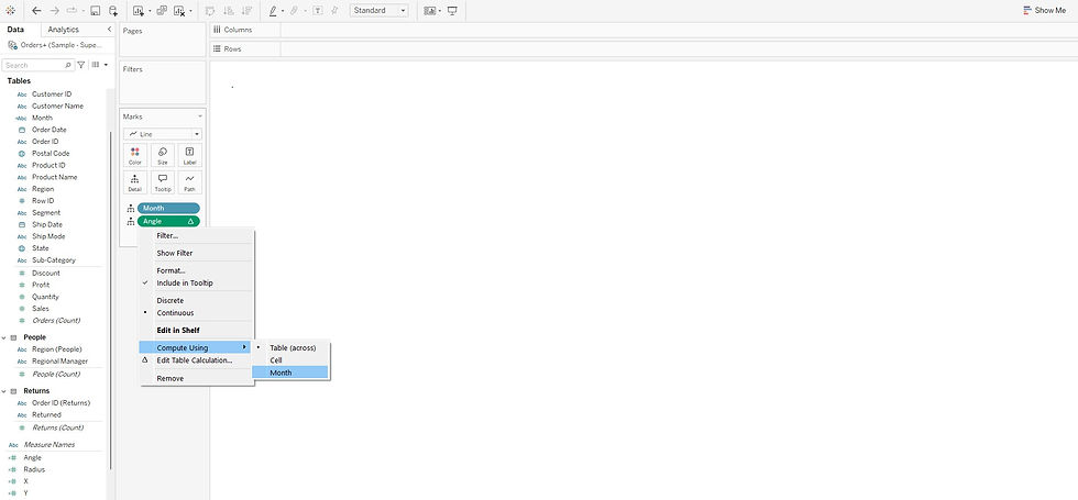
Set Angle to Compute Using Month:
Click on the Angle pill in the Detail shelf, then select Compute Using > Month. This makes sure Tableau computes the angle for each month.
Drag X to Columns:
Drag the X calculated field to the Columns shelf to create the horizontal axis.
Drag Y to Rows:
Drag the Y calculated field to the Rows shelf to create the vertical axis.

Change the Shape to Polygon:
In the Marks card, change the mark type from Line to Polygon to form the web-like structure of the radar chart.


Put Angle in Path:
Drag the Angle field to the Path shelf. This ensures that the points are connected in the correct sequence to form the radar shape.


Add Year to Color:
Drag Year from your dataset (e.g., Order Date) to the Color shelf. This step will color each year differently, making it easier to compare data from different years.

Adjust Opacity: In the Color pane, adjust the opacity of the polygons to distinguish overlapping areas better.

Retain only the 3 years of data (filtering out 2019, for better visualization for the readers to understand. You can remove 2018 at this step for the case we have taken) and Edit Colors as needed.


When you hover over the months' data in your radar chart, and notice that the order of the months is reversed (counterclockwise), it's because the angles are being plotted in the opposite direction. To fix this and make the months display in clockwise order, we need to adjust the angle calculation.


To achieve clockwise orientation, you simply add a negative sign (-) before the angle sum formula.


To make December appear at the top (12 o'clock position) instead of September for better visualization, we need to further adjust the angle formula. The goal is to shift the starting point of the radar chart so that December aligns with the topmost position.
To achieve this, Angle formula can be adjusted as - RUNNING_SUM (2 * PI() /12) + PI()/2. when we apply the adjustment by adding PI() / 2, we rotate the entire chart by 90 degrees counterclockwise. This shifts the starting point from September to December, placing December at the top of the radar chart (12 o’clock position).


Go to the Format pane and turn off grid lines for both axes to make the chart cleaner.

Step 3: Adjusting the Axes
To ensure that the radar chart aligns well with the maximum sales value (which is below 120k, in our case), we can adjust both the X and Y axes to fit within this range. This will enhance the readability of the chart and allow the data to be more accurately represented.

Steps to Adjust the X and Y Axes:
Edit X and Y Axes:
Right-click on the X-axis and select Edit Axis.
Set the fixed range for the X-axis between -120,000 and 120,000 to capture the entire range of data points.
Repeat the same process for the Y-axis, setting it to the same fixed range.


Symmetry in X and Y Axes:
Ensuring both axes have equal ranges will maintain the circular shape of the radar chart, and data points will be properly scaled within the chart.
A maximum of 120,000 in both directions keeps the chart balanced and provides room for any variation in sales values.
By setting the axis ranges to -120k to 120k, the radar chart will fit neatly within the frame, ensuring all data points are visible and allowing for a more visually appealing and informative chart.
Step 4: Adding a Background Spider Web
An important step in enhancing the readability and visual appeal of a radar chart is adding a background spider web. This grid-like structure helps in emphasizing the radial nature of the chart, making it easier to compare data points across categories. The spider web acts as a reference guide, allowing users to better understand the relative positions of data points and identify patterns. It also enhances clarity, especially when multiple series are plotted. In the next blog, we will dive deeper into how to create, add and customize a spider web background in Tableau to elevate your radar charts further!
RECAP of calculated fields:
Calculated Field Name | Purpose | Applied On | Axis | Formula |
Month | Convert order date into month for time-based segmentation | Order Date | X | DATENAME('month', [Order Date]) |
Angle | Assigns an angle based on the month (in radians) | Month | X | -RUNNING_SUM(2 * PI() / 12) +PI()/2 |
Radius | Calculates the sales value to determine the distance | Sales | Y | SUM([Sales]) |
X | Defines the X-coordinate using cosine | Angle, Radius | X | [Radius] * COS([Angle]) |
Y | Defines the Y-coordinate using sine | Angle, Radius | Y | [Radius] * SIN([Angle]) |
Happy learning! May your exploration of radar charts in Tableau lead to valuable insights and improved data visualization skills!