_edited_edited.png)
The histogram is a popular graphing tool. It is used to summarize discrete or continuous data that are measured on an interval scale. It is often used to illustrate the major features of the distribution of the data in a convenient form.
A histogram has an appearance similar to a vertical bar chart, but there are no gaps between the bars. Generally, a histogram will have bars of equal width.
In this example you can see a continuous data( Months of order date ie January to December) is in the columns and a measure(Sum of sales) in the rows.
In this example of Histogram, you can see the sum of sales per month

When we have to see Region wise sale you can add Region to pages ,make it a motion chart.You can see play button with Region title on the right.Click play button of the region you can see different regions sales per month.
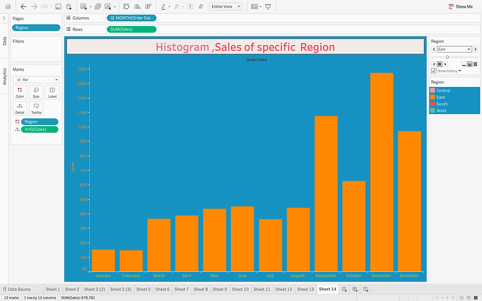
Drag Region to Pages to get the Sales charts for different regions as a motion chart.

A histogram can be used to show either continuous or categorical data in a bar graph. For continuous data we will put the data into artificial categories called bins.
This is another example for creating a Histogram.In this histogram ,you can see there is Age bin, of size 10 created.Inorder to create a bin,right click on the age dimension-select size of bin according to your data analysis.
Age bin is the continuous data plotted against no of patients ,here there is a calculated field for checking patients
oxygen saturation level,according to that the Histogram is grouped to Mild,Moderate,Normal,Severe levels of oxygen saturation.
Let us see difference between Histogram and Bar chart.Bar graphs are used to compare things between different groups or to track changes over time.
Example of Bar chart

Comparison of Bar chart and Histogram chart
Histogram | Bar Graph |
The histogram is a term that refers to a graphical representation that shows data by way of bars to display the frequency of numerical data. | The bar graph is a graphical representation of data that uses bars to compare different categories of data. |
Distribution of non-discrete variables. | Comparison of discrete variables. |
Bars touch each other, so there are no spaces between bars. | Bars never touch each other, so there are spaces between bars. |
To display the frequency of occurrences. | To compare different categories of data. |
In Histogram, we cannot rearrange the blocks. | Bar graph, it is common to rearrange the blocks, from highest to lowest |
Bar graph represents categorical data. | Histogram represents numerical data (discrete or continuous data). |
The x-axis can represent anything. | The x-axis should represent only continuous data that is in terms of numbers. |
Box and Whisker Plots
Box and whisker plots, sometimes known as box plots, are a great chart to use when showing the distribution of data points across a selected measure. These charts display ranges within variables measured. This includes the outliers, the median, the mode, and where the majority of the data points lie in the “box”. These visuals are helpful to compare the distribution of many variables against each other.

In a box and whisker plot:
The left and right sides of the box are the lower and upper quartiles. The box covers the interquartile interval, where 50% of the data is found.
The vertical line that split the box in two is the median. Sometimes, the mean is also indicated by a dot or a cross on the box plot.
The whiskers are the two lines outside the box, that go from the minimum to the lower quartile (the start of the box) and then from the upper quartile (the end of the box) to the maximum.
The box and whisker plot can be presented horizontally, like in figure or vertically.
The interquartile range (IQR) measures the spread of the middle half of your data. It is the range for the middle 50% of your sample. Use the IQR to assess the variability where most of your values lie. Larger values indicate that the central portion of your data spread out further. Conversely, smaller values show that the middle values cluster more tightly.
The maximum score is the highest score, excluding outliers (shown at the end of the right whisker).
Whiskers: The upper and lower whiskers represent scores outside the middle 50% (i.e., the lower 25% of scores and the upper 25% of scores). The interquartile range (IQR) ranges between the 25th and 75th percentile).
A box and whisker plot is defined as a graphical method of displaying variation in a set of data. In most cases, a histogram analysis provides a sufficient display, but a box and whisker plot can provide additional detail while allowing multiple sets of data to be displayed in the same graph.
When measuring variability, statisticians prefer using the interquartile range instead of the full data range because extreme values and outliers affect it less. Typically, use the IQR with a measure of central tendency, such as the median, to understand your data’s center and spread. This combination creates a fuller picture of your data’s distribution.
Upper Whisker: 1.5* the IQR, this point is the upper boundary before individual points are considered outliers.
Upper Hinge: The top end of the IQR (Interquartile Range), or the top of the “Box”
Median: Middle value by count of values
Lower Hinge: The bottom end of the IQR (Interquartile Range), or the bottom of the “Box”
Lower Whisker: 1.5* the IQR, this point is the lower boundary before individual points are considered outliers.


IQR = Q3 – Q1
Equivalently, the interquartile range is the region between the 75th and 25th percentile (75 – 25 = 50% of the data).
To find outliers, you’ll need to know your data’s IQR, Q1, and Q3 values. Take these values and input them into the
equations below. Statisticians call the result for each equation an outlier gate.
Q1 − 1.5 * IQR: Lower outlier gate.
Q3 + 1.5 * IQR: Upper outlier gate.

In this graph you can see segment wise sum of sales.Drag ship mode ,Region to detail in Marks.
Outliers are there for corporate segment(Upper outlier gate).which shows extreme values
You can see the data between upper outlier gate and lower outlier gate.Here 25% data in between upper whisker and box(rightmost in horizontal box chart) and another 25% data in between lower whisker and box(leftmost in the picture), 50% of data lies within the box.
The maximum sales,(excluding outliers ) is shown at the right whisker. Minimum sales is shown at the left whisker.
Comparison of Box and Whisker plot and Histogram
Boxplots do not show as much detail as histograms do, but they give a quick visualization of the spread of the data.
Histograms indicate the whole frequency distribution of a variable, whereas the boxplot summarises its most prominent features. These features include median and spread as well as the extent and nature of departures from symmetry, and the possible presence of observations having extreme values (outliers).
Hope you got good understanding about Histogram and box chart.
Happy Learning!