_edited_edited.png)
Radial chart is also known as Polar line chart is useful for displaying cyclical data of several series in a circular form. In a radial visualization , each bar appears in a circle with loger bars that represent larger values.
Let us see how to create amazing radial chart .
Here I am taking a simple dataset contains teamwise result of a competition

Create a union with same table sheet1. We can see a new column ‘Table Name’ at the end

Create a calculated field Path for starting point 0 and endpoint 270.

Create bins for Path with size 1

Create an Index calculated field. I used INDEX()-1 because first row of index starts from 1 but Path value starts from 0 to 270

Next we need X and Y values to start with our radial chart


RADIANS function converts number from degrees to radians value. SIN funciton to return Sin value and COS function returns Cos value of a number.
Put X on rows and Y on Columns. Put Path(bins) to Columns and make sure that all Missing values are checked.

Make Marks to line and move Path(bin) to path

Click on X – Compute Using – Path(bin)
Click on Y – Compute Using – Path(bin)


Now to show case teams put Team number to color. We want each team in different circles. So we need to create calculated fields for that
Total_Cal_GrandTotal

Rank_calc – Will help to create different circles for different teams

Now we need some changes in X and Y values.
Multiply X and Y values with Rank_calc

Again Click on X and Y and make it to Compute Using Path(bin)

Go to Edit table Calculations – Nested Calculations – Rank_calc
Select Team Number instead of Path for both X and Y


We have different circles for different teams. Next we need to create a calculate field Total Grand total

We have to create Percentage calculation

Create a calculated field that helps us to change the size of radials based on the percentage.

Make changes in our X and Y calculatios
Add Size_cal into radiance


No radial in our chart . Inorder to make radial we need to repeat the process
Go X an Y Make it Compute Using Path(bin)

Edit table calculations. Again change Rank_calc – Path to Team Number

And select Size_cal in our nested calculation - Select both Path(bin) and Team Number and move Team Number to top

For Total_gTotal follow the above steps also

Follow the same steps for Y calculations as well
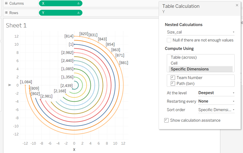
We can see that our radial chart has taken the shape as we needed
Add Team Number and grand Total to Label our radial chart is ready.

Have you noticed exercise ring in apple watch?. Its a radial chart in real life scenario

Hope this post explaining about radial chart is helpful for you. Thank you
References:
https://www.youtube.com/watch?v=yR_Mjy8V-0k