A Radial or Circular Bar Chart is a type of bar chart displayed on a polar coordinate system rather than a Cartesian system. This visualization method arranges bars in a circular format to facilitate comparisons among categories.
In this blog, we will create a Radial Bar Chart using the sample Superstore dataset. This chart will help us visualize and compare data in a circular layout, offering a distinctive perspective on your data.
Requirement: To analyze the percentage of sales by Region and identify which region has the highest sales in the Superstore dataset.
Method:
1. Connect the Sample- Superstore data to the Tableau workbook.
2. We will use data from the Orders sheet ( 21 fields , 9994 rows) out of three sheets available in the Superstore dataset(Orders, People and Returns). Drag the Orders sheet into the view and create a union by dragging the Orders sheet over the existing one. After the union, we will have 23 fields and 19,988 rows, and a new column called 'Table Name' will appear.
3. Calculated Fields used:
i) Path: It will provide starting and end point for our Radial chart.
IIF([Table Name]= 'Orders', 0, 270)
ii) Path (bin): Right click on Path, go to Create and select bins...
This will help us create evenly distributed data points between the numbers 0 and 270, which we specified for our calculated field 'Path.'
iii) Index-1: Since our Path value starts at 0, we need to subtract 1 from the Index, as the Index starts at 1.
INDEX()-1:
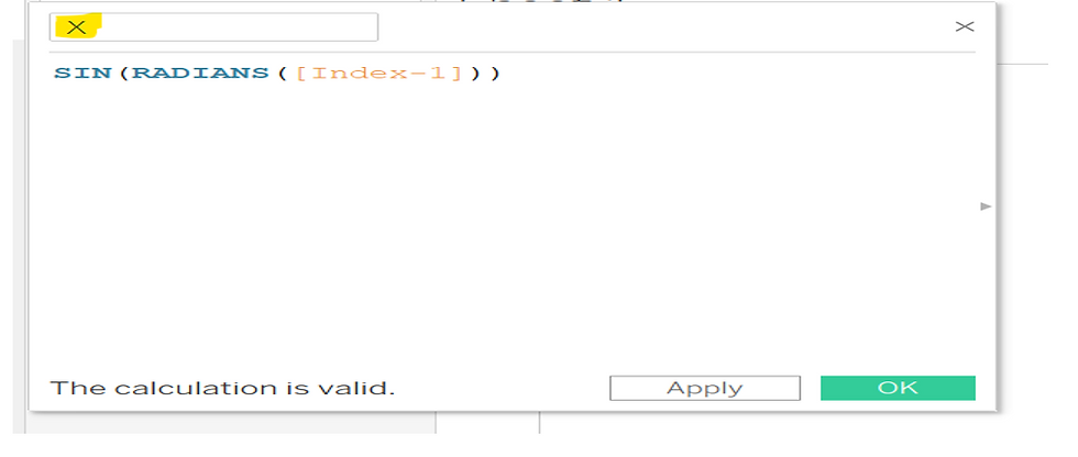
iv) X: SIN(RADIANS([Index-1]))
v) Y: COS(RADIANS([Index-1]))
vi) Total Reg. sales:
WINDOW_SUM(SUM([Sales]))/2
We are dividing the sum of sales by 2 because the records in our dataset were doubled when we created the union of the Orders sheet in step 2.
vii) Total sales:
WINDOW_SUM(SUM([Sales]))/2
viii) Percent calculation:
[Total Reg. sales]/ [Total sales]
ix) Size calc: This will help us adjust the size of the circles based on the calculated percentage.
[Percent calculation]/WINDOW_MAX([Percent calculation])
x) Rank calc: This will help us create distinct circles for each Region. 'asc' stands for ascending order.
RANK_UNIQUE([Total Reg. sales],'asc')
4. Next, drag 'X' to Columns, and 'Y' and 'Path (bin)' to Rows. Also, ensure that 'Show Missing Values' is selected for 'Path (bin).'
5. Now, change the Marks card from 'Automatic' to 'Line' and move 'Path (bin)' from Rows to the Path.
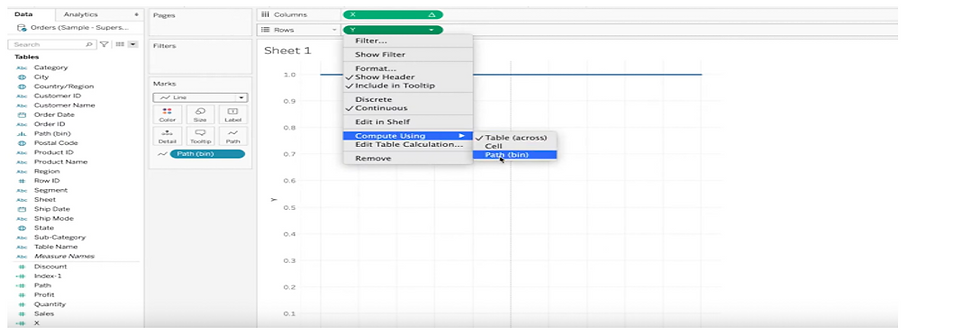
6. Next, click on 'X' in Columns and select 'Compute Using' > 'Path (bin).' Similarly, select 'Compute Using' > 'Path (bin)' for 'Y' in Rows.
Following the above steps will result in the creation of our circle.
7. To showcase Regions in circle, will drag Region to Color.
We will observe that this circle shows information for only one Region at a time.
To display different regions in separate circles, we will move on to the next step.
8. Next, we will edit the 'X' and 'Y' calculated fields and multiply both by the 'Rank Calc' calculated field.
9. We will repeat step 6 and select 'Compute Using' > 'Path (bin)' for both 'X' and 'Y.'
We will get the following result after that:
10. In the next step, we will edit the table calculations for both 'X' and 'Y,' select 'Rank Calc' in the nested calculations, and choose 'Region' instead of 'Path (bin).'
Now, we will have different circles representing each region from our Superstore dataset.
11. To display the size of the circles based on the percentage of sales for each 'Region,' we will edit the 'X' and 'Y' calculated fields again and add 'Size Calc' to the Radians, as shown below.
X: SIN(RADIANS([Index-1] [Size calc]))[Rank calc]
Y: COS(RADIANS([Index-1] [Size calc])) [Rank calc]
12. To bring the radial back into the view, we will repeat the same process for 'X' and 'Y' by selecting 'Compute Using' > 'Path (bin).'
Result:
13. Next, edit the table calculation for ‘X,’ and deselect ‘Path (bin),’ and select ‘ Region’ in ‘Rank calc.’
Then, go to 'Size Calc' in the Nested Calculations, select both 'Region' and 'Path (bin),' and move 'Region' to the top. Repeat the same steps for 'Total Sales': select both 'Region' and 'Path (bin),' and move 'Region' to the top.
Follow the same steps for ‘Y’ too.
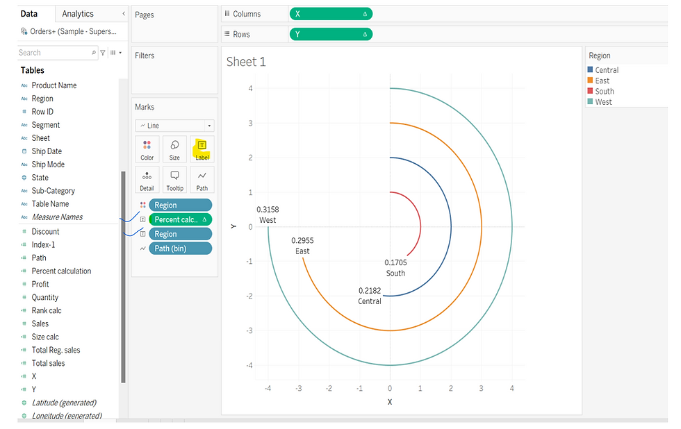
Our radial chart has taken the shape we need.
14. Next, we will add ‘Percent calculation’ and ‘Region’ to the label.
15. Next, will do some changes in Label and format our radial Chart.
I hope this blog helps you create a radial bar chart that meets your requirements !!
Thank You!!
_edited_edited.png)


