_edited_edited.png)

A Radial Bar Chart is essentially a Bar Chart plotted on a polar coordinates system, rather than on a Cartesian one. Radial Bar Charts are valuable in showing comparisons between categories by using circularly shaped bars. However, because the bars are plotted on different radial points of the polar axis, they have different radii and cannot be compared by their lengths. A bar on the outside will be longer by construction than one on the inside, even with an equal value. With a radial bar chart, each bar appears in a circle with longer bars representing larger values. So let's get started and see how to make this eye-catching chart in Tableau.
Step 1: Connect to the dataset. The dataset we are using is Sample Superstore Dataset. We will be using the Orders sheet, so drag it to the view.

Step 2: To plot our circular bars in a Radial Bar Chart, we need two points for each subcategory of sales, the start and end points. The start point indicates where to start our circular bars, and the endpoint indicates where to stop them. For that, we need to create a union of the orders sheet. After creating the union we will see that a new column named Table Name is created.

Step 3: For creating the starting and end point we need to create a calculated field Path.

As we can see in the below figure, we have both the starting and end point for each subcategory. But as we drag sales to view, we see that we have duplicate values of sales for each subcategory. So we will divide sales by 2 for our future calculations.

Step 4: Now we will create the Path Bin which will give us evenly spread data points between 0 and 270 that we have created in our calculated field.


Step 5: For the values from 0 to 270 we have to create an index. For this, we will create Index calculated field.
We have used Index() - 1 because the Index function gives values from 1 and our values start from 0 to 270.

Step 6: To plot our chart we need X and Y coordinates. So we will create two calculated fields, one for the X-axis and another for the Y-axis.


Step 7: After these steps let's see how our chart is taking shape. For this, drag the X-axis to columns and the Y-axis to rows. Drag Path Bin to rows and make sure Show Missing Values are checked.

Convert the marks card from Automatic to Line move Path Bin from rows to Path

Step 8: Click on X and Y and select Compute Using - Path Bin.

Step 8: After all these steps, our chart will look as follows.

Now we want a circle for each subcategory, so we drag the subcategory to colors. This will show the circle of different colors for each sub-category and when we drag the cursor around the circle we will see our Path Bin is created from 0 to 270

Step 9: As we can see only one circle is displayed for all the subcategories. But to create separate circles for each subcategory we will create a few calculated fields.
Total Category Sales : Total Category Sales: As mentioned earlier, we have duplicate values for sales for each subcategory. So we divided the sum of sales by 2

Rank: We need this in order to rank our rings from smallest to largest. The rank function will give the rank to each subcategory based on sales and sort them in ascending order.

Step 10: Now we will do some changes in the X and Y axis. We will multiply X and Y axis by the Rank_calc created.


Step 11: Again we will click X and Y axis and select Compute using Path Bin. Now our chart will look as follows.

Step 12: Click on Edit Table Calculation. In Nested calculation select Rank_Calc and in Compute using select Sub-category instead of Path Bin.

Follow the same steps for Y Axis in the Edit Table calculation

Step 13: After the above steps, we will get the following chart.
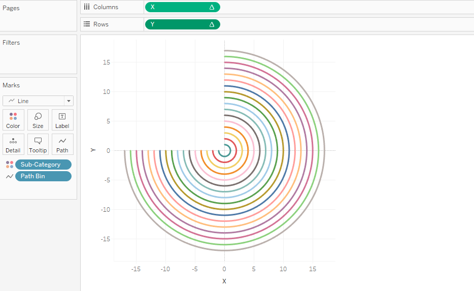
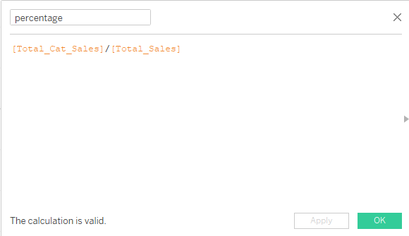
Step 14: Now we will calculate the percentage for each subcategory and the size of the radials will be according to the percentage of sales of the subcategories. For this, we need to create another calculated field Total_Sales. Now we will create another calculated field for Percentage.
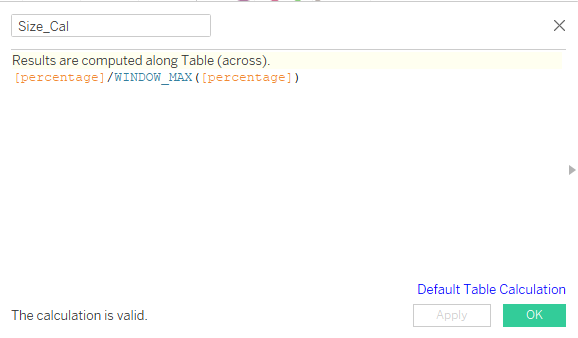
Step 15: T create the size of radials based on percentage, we will create another calculated field.
Step 16: Now again we will do some changes to X and Y Axis.


Step 17: Go to X and Y Axis and select compute select Compute Using Path Bin. Follow the below screenshots to edit the table calculations.


Note: Drag Sub Category on the top of the path bin.

Note: Drag Sub Category on the top ofthe path bin
Step 18: Drag the percentage calculation and sub category to labels and after formatting, this is how the final Radial Chart looks like.

A radial chart can be created by following the steps outlined in this blog. I hope you will find it useful. Thanks for taking the time to read.