_edited_edited.png)
A packed circle chart ,or onion chart, is the chart where many circles share the same base.

This is a chart that can be used as an alternative to bar chart or even a pie chart. If you think you have too many bar charts in your visualization, you can give this a try. It gives a fresh look to your dashboard.
Making the packed circle chart requires a little more steps than the bar chart or the pie chart, but it is very useful when you have a little place and have to cramp up more information.
In order to make the packed circle chart, aka onion chart first we have to create a new Excel sheet that contains the path which the lines have to flollow. Since it is a circle the path starts at 0 and ends at 360.

I have named the sheet Model.xlsx.
Step 2 : Add the sheet along with the Sample Superstore dataset to the Tableau and make an outer join.

Open the Orders sheet once it has been dragged to the Data Source Pane. Join the Model.xlsx sheet .
Click on “Add new join Calculation” for both the sheets and enter ‘1’ .Make a full outer join.

Step 3: Once the two sheets are joined then go to Sheet. Create bins from the column “Path” under Model.

Make Bin Size as 1.
Step 4:Create calculated field 'Index'.

Step 5 : Create two more calculated fields for the X and Y axis.


Step 6 : Create a calculated field to determine the sum of sales of each subcategory using the following calculation.

Step 7 : Add the X and Y calculated fields to the 'Rows' and 'Columns' respectively.
Step8 : Change the chart type to 'Polygon' under the 'Marks label.

Step 9 : Add 'Path(bin)' field to 'Path' under marks card.

Step 10: Go to Rows. Click on the drop down menu from the 'X' field . Change to 'Compute Using' --> 'Path(bin)'.
Perform the same change for field 'Y'.
Step 11: You will get a visualization like below.

Step 12: Add the 'Sub - Category ' to color in Marks card.
Step 13: Change the 'X' and 'Y' calculated field as below


Step 14: Perform Step 10 again after changing the calculated field so that the axis is computed using the path.
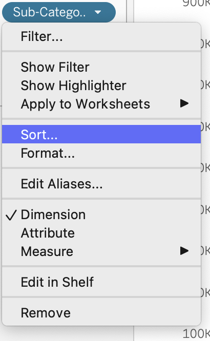
Step 15:Sort the 'Sub-Category' in Ascending order by using the 'Sales' field.

The output of the above step will change the visualization like below.

Step 16: In order to add the labels and the sales value by each Sub category to your visualization. Add either 'X' or 'Y' to the columns or rows respectively. I added another 'X' calculated field to the rows and changed it to a line chart


After you get the above representation of onion chart in line add the 'Sub Category' and 'SUM(Sales)' to the label . Feel free to remove the axis and grid lines and your packed circle chart is ready.

One interesting fact is that a little change in one of the calculated fields will produce another beautiful charts made just from concentric circles. Just like the below.

Are you thinking 'which calculated field??' I will leave it for you to explore.Put on your thinking hats.
Keep learning and keep exploring. Do try this charts out and let me know how it works for you in the comments.
References