#Netflix#Tableauforbeginners#Netflix dashboard#data analysis#data analyst #data science#Data Science Road Map

Introduction
What is tableau dashboard?
A Tableau Dashboard is a presentation of multiple data visualizations and insights on one single screen. Tableau Dashboard acts as a one-stop solution to simultaneously monitor a wide range of real-time business intelligence information and make result-oriented decisions. Now, lets start step by step process to create a Netflix dashboard in tableau.
Data source : Netflix titles
How to Import files in Tableau public?
STEP :1- Import the .csv file by clicking on ‘Text File’ and look for the path where you have saved the Netflix title as a file so you retrieve it into the Tableau Public workspace.(Follow the images below)


NOTE: In the dataset we have available data such as; Fields, more than k rows. Each movie has show id, type (It can be a movie or tv show), we have the different titles as string, we have different directors, the cast, date, and the release year, rating the duration. different seasons, etc….
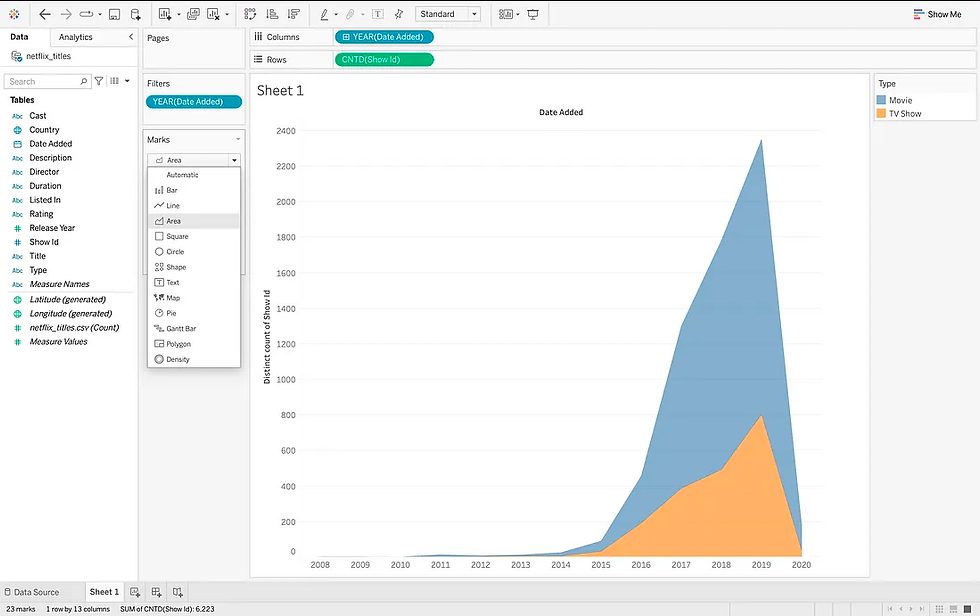
AREA CHART: It is a type of data visualization that shows the magnitude of change over time. It is similar to a line chart, but instead of simply connecting the data points with a line, the area between the line and the x-axis is shaded in. This area represents the cumulative total of the data points up to that point in time.
GOAL: To plot the different tv shows and movies added to Netflix by date.
PROCESS: Put the date added in the columns and show id in the rows and convert it into measure as Count distinct and bring the type in the colors. Now the year has null values, press on control key & drag the years in the filters and click years next and omit null values.


Now the year has null values, press on control key & drag the years in the filters and click years next and omit null values.


Under Marks, Convert the chart to an area chart and change the colors according to Netflix, it is with shading or the background which is black and written in red.


Change the title and relocate in middle, put in bold and change the color as red you can click on more colors and change the background color to black. Remove the gridlines rows gridlines, put them in white and bold. legend could be hidden by clicking on hide card.


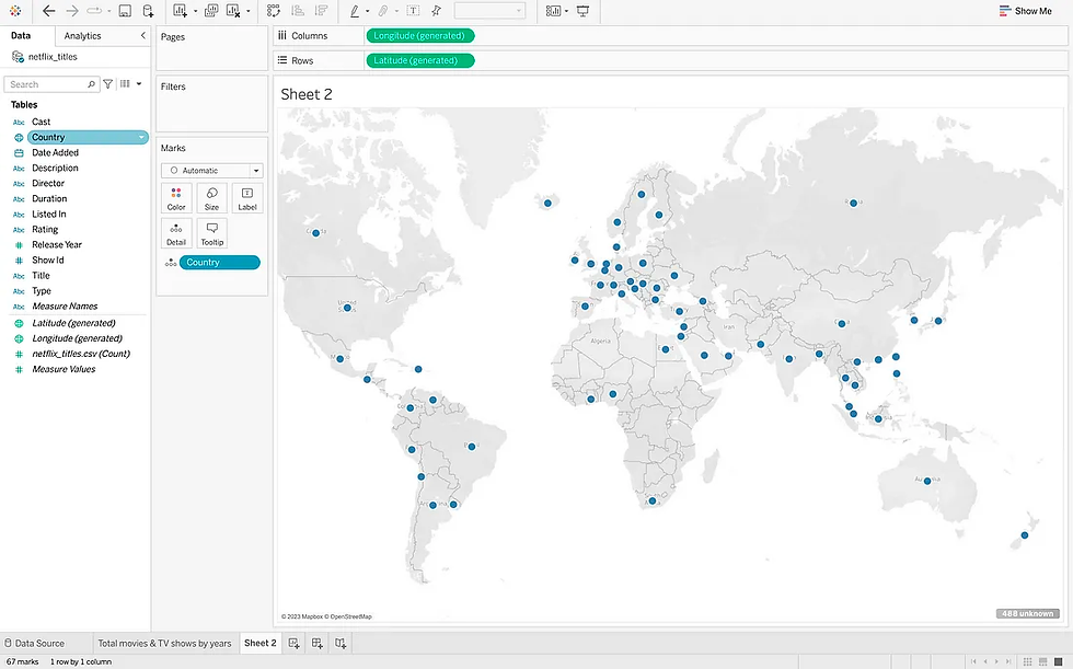
MAP CHART: It is a type of data visualization that uses a map to display data. Map charts can be used to show the distribution of data over a geographic area, or to compare different data values across different geographic areas . Map charts are often used to show data such as: Population density, Crime rates, Unemployment rates, Election results, Sales data, etc….
GOAL: To count the total movies and tv shows country wise.
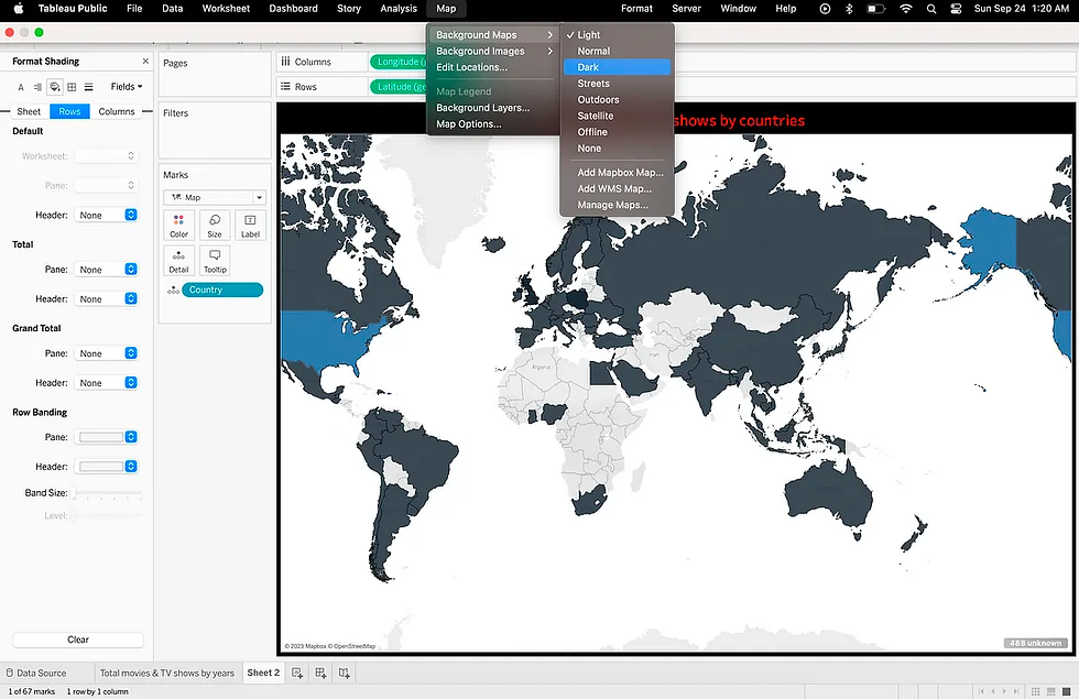
To create a map, define each country by color and the darker is the color the more movies that this country has released. Double click on country and the mark down to map. Click on the title to change it to total movies and tv shows by country. As before, place in center in bold and red.


Change the background of the worksheet by right click and change it to black & do the same thing for the map, click on map background maps and on dark. Map color can change to red.


Drop show id into into colors okay and click on measure, Count distinct. As you can see here the united states has the highest value and the remaining Countries has the least value as USA.

HISTOGRAM: It is a type of data visualization that shows the distribution of a quantitative variable. It is created by dividing the variable into ranges, called bins, and then plotting the number of data points that fall into each bin. The height of each bar in the histogram represents the frequency of the data points in that bin.Histograms are often used to show the distribution of data such as: Age, Height, Weight, Income, Sales.
GOAL: What are the top 10 journals in the entire listings for example, drama, romantic movies, horror movies, etc…
Select the Dimension listed in and drop it into rows & show id in text & columns and convert in into count distinct. Now, Click in filter in the listed in rows and select top 10, and horizontal bars will appear. Hide the field for rows & edit the axis and remove the title. Repeat the above process for background color put it black, text should be in white bold and remove the columns grid lines. Now drag the count into label to get different values depending on each type. We have the documentaries on 6th rank and Stand-up comedy on first.


PACKED BUBBLE CHART: It is a type of data visualization that uses circles of different sizes to represent data points. The circles are packed together in a way that maximizes the space used and minimizes the gaps between the circles. Packed bubble charts are often used to show hierarchical data, such as the structure of an organization or the product categories of a company. They can also be used to show data that is distributed across different categories, such as the sales of different products in different regions.
GOAL: To see the distribution of Movies and TV shows percentage wise and type wise.
Drag the type in the rows & put the show id in text (Change into count distinct). and and size. Click on quick table calculation and select percent of total.


Change the title to bold in red and hide the card. Change the worksheet background to black. Here we have the total movies and tv shows by the percentage and the exact value.

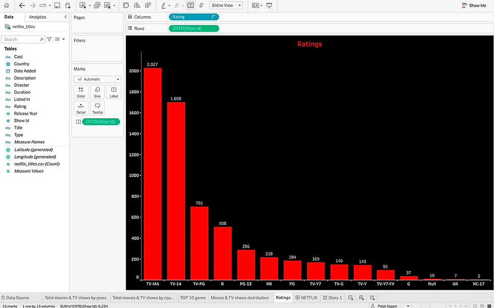
BAR CHART: it Is a type of data visualization that uses bars to represent data points. The bars are typically arranged horizontally, with the height of each bar representing the value of the data point. Bar charts are often used to compare different data values or to show the distribution of data over time. Bar charts are a popular choice for data visualization because they are easy to read and understand. They can also be used to visualize a wide variety of data types, including numerical data, categorical data, and time series data.
GOAL: To find the ratings of the Show Id in the descending order through bar chart.
Put the ratings in the column, & show id in the rows and convert it into count distinct. Reorder the chart and add the count Show id into the labels. Change the title to bold in red and hide the card. Change the worksheet background to black. Here we have the ratings of the Show Id in the descending order through bar chart.


Dashboard: Link to Tableau Public: https://public.tableau.com/views/NETFLIXDashboard_16955367220370/Story1?:language=en-GB&publish=yes&:display_count=n&:origin=viz_share_link
CONCLUSION: Now that you know how to create a Netflix dashboard with Tableau, you can start to explore your own data and identify patterns and trends. You can also use your dashboard to communicate your data to others in a clear and concise way.
_edited_edited.png)