_edited_edited.png)
Introduction to Power BI
Power BI Overview
Power BI is a powerful business analytics tool from Microsoft that makes it easy to visualize and share data insights. It allows you to create interactive reports and dashboards, helping businesses uncover trends and patterns in their data. Plus, you can embed these visualizations into apps or websites, making it easier to share important insights with a wider audience.
Core Components of Power BI
Several crucial tools that simplify the data analysis process are included in Power BI:
Power BI Desktop: The program used to create the majority of reports and visualizations
Power BI Service: A cloud-based tool that facilitates report sharing and collaboration
Power BI Mobile: The mobile application to view and engage with reports while on the go.
Power Query: A data collection, transformation, and preparation tool
DAX (Data Analysis Expressions): a formula language for making unique measurements and computations.
Power BI Report Server: An on-premises tool for publishing and managing reports.
Power BI Embedded: Allows embedding Power BI reports into other applications.
When combined, these elements make data analysis easier and improve teamwork.
Why Visualizations Matter
Complex data is made simpler by visualizations. They speed up decision-making and enhance communication by making it simpler for everybody to comprehend important trends and patterns
2. Getting Started with Power BI Visualizations
Once you know the processes, creating Power BI visualizations is easy. To begin, adhere to this guide:
A. Steps to Create Visualizations in Power BI

1. Open Power BI: Go to the Power BI Service (web version) via your web browser or use the Power BI desktop application on your PC.

2. Load Your Data:
Click "Get Data" in the Power BI Desktop ribbon.
Choose your data source (Excel, SQL Server, etc.).
Select the tables you want to import

3. Create a Report: Once your data has been loaded, select the "Report" view. This is where your visualizations will be constructed.
4. Choose Your Visuals: A window on the right side of the screen displays every kind of visual you can make, including tables, pie charts, bar charts, line graphs, and more. Put your data into visual form. Decide which kind of visualization you would like.

5. Drag and Drop Fields: Drag fields from your dataset into the relevant areas of the graph in the Visualizations pane. For example, in a bar chart, drag the date field to the 'Axis' and the sales field to the 'Values' area.

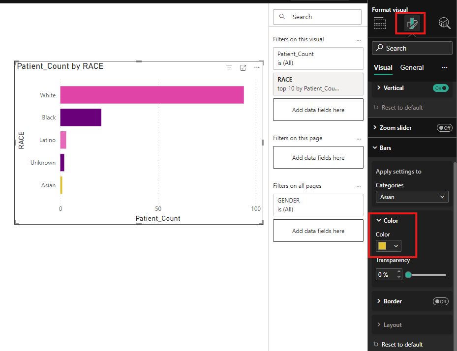
6. Customize Your Visuals: Use the formatting options in the Visualizations pane to adjust colors, labels, and titles to fit your needs.
7. Save Your Report: Save your report in Power BI using File > Save to save it locally.

You may start using Power BI to create powerful visuals and analyze your data in an understandable and captivating manner by following these steps.
B. Basic Charts in Power BI
Basic charts are essential visualizations that provide straightforward representations of data. They are user-friendly and effective for beginners who are just starting their journey with Power BI. They are
1. Bar Chart
A bar chart that displays the data using rectangular bars. The length of each bar shows how much the specific value and making it easy to compare different categories at a glance.
When to Use:
Category Comparison: Compare values across different groups, such as the number of diabetic patients by age or gender.
Ranking: Rank items based on their values, like comparing treatment types by effectiveness.
Frequencies or Counts: Show how often something happens in various categories, like complications from diabetes.
Non-Time Data: Great for comparing static data like HbA1c levels.
Easy Interpretation: Bar charts are great when you have fewer than 10 categories to compare.
Use Case: Compare the number of diabetic patients by age group.

2. Column Chart
Similar to a bar chart, a column chart displays the data using vertical bars rather than horizontal ones.
When to Use:
Time-Based Data: Track changes over time, like monitoring monthly blood sugar levels.
Category Comparisons: Compare values across groups, such as HbA1c levels by age.
Highlight Patterns: Identify trends over a timeline, like increases or decreases in data.
Sequential Data: Analyze events over time, such as quarterly diabetes diagnoses.
Use Case: Count patient visits by BMI category and gender.

3. Line Chart
A line chart connects data points with a line, helping to identify patterns over time.
When to Use:
Trends Over Time: Line charts are great for showing changes over time, such as tracking glucose levels.
Continuous Data: Perfect for showing data progression, like BMI changes.
Comparisons: Easily compare trends, such as HbA1c levels by age.
Emphasis on Patterns: Spot sudden rises or falls in your data.
Use Case: Track glucose levels and BMI trends across genders.

4. Pie Chart
A pie chart represents data as circle slices, indicating proportionate values relative to the whole.
When to Use:
Proportions: Ideal for showing parts of a whole, like the percentage of patients using insulin vs. oral medication.
Limited Categories: Best with 3 to 6 categories to keep it easy to read.
One Variable: Focus on one variable, like the distribution of diabetes types.
Quick Insights: Great for highlighting key proportions quickly.
Use Case: Track the percentage of patients using different diabetes management strategies.
5. Donut Chart
A donut chart resembles a pie chart but has a hole in the center that makes it look like a ring.
When to Use:
Show Parts of a Whole: Perfect for showing contributions to a total, with space in the center for important information.
Aesthetic Design: Ideal when you want to make your data visually appealing.
Limited Categories: Works well with 3 to 6 categories.
Comparison of Proportions: Great for highlighting the size of different categories.
Use Case: Display the proportion of patients by BMI levels

6. Area Chart
An area chart fills the area beneath a line to show cumulative totals over time.
When to Use:
Cumulative Data: Display totals over time, like the number of diabetic patients diagnosed.
Trends Over Time: Track how glucose levels fluctuate month by month.
Comparing Categories: Perfect for comparing multiple groups, like diabetes treatment types over time.
Highlighting Size: Emphasizes the overall trend, like the growth in insulin usage.
Use Case: Use area charts to show cognitive scores over time, helping to identify trends in cognitive health.

7. Card
A card is a compact visualization element that highlights key metrics or summary information at a glance.
When to Use:
Key Metrics: Show crucial data, like average blood sugar levels or total diabetic patients.
Emphasizing KPIs: Cards are great for showing individual data points, such as insulin usage or glycemic control.
Compact View: Provides a clean, easy-to-read format for summarizing information.
Dashboard Elements: Cards are useful in dashboards because they allow multiple key metrics to be shown simultaneously without being overbearing.
Use Case: To display an important indicator, such as the percentage of patients with appropriate glycemic control, the mean blood sugar levels, or the total number of people with diabetes.

8. Table
A table is an organized format that shows specific information in rows and columns, making it easy to compare particular data points.
When to Use:
Detailed Information: Use tables when you need to present patient records, treatment plans, or lab results.
Comparing Data: Ideal for looking at multiple data points side by side, like age, gender, and diabetes type.
Handling Large Data Sets: Great for presenting large amounts of data with precise values, such as blood sugar levels.
Raw Data Presentation: Perfect for showing data without needing trends or graphs.
Use Case: To display comprehensive data, including demographics, treatment plans, lab findings, and medication adherence, about specific individuals or records.

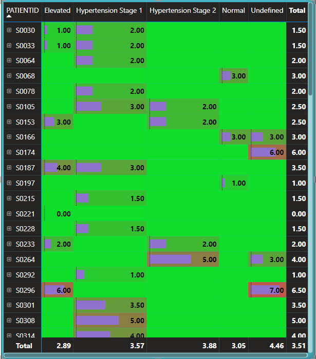
9. Matrix
A matrix is a technique for visualizing data that enables summary and analysis across several dimensions, making comparison and grouping easier.
When to Use:
Multiple Dimensions: Use matrices when you need to look at several factors at once, like age, treatment type, and glucose levels.
Cross-Category Comparison: Compare groups, like examining how diabetes complications vary by age.
Complex Relationships: Great for showing how different factors interact, such as blood pressure and medication adherence.
Large Data Sets: Helps summarize and organize large data sets into readable rows and columns.
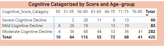
Use Case: Analyze data across multiple factors, such as age groups, gender, and cognitive scores.

These fundamental Power BI charts offer straightforward yet effective methods for data visualization and analysis. These charts can assist you in effectively and clearly presenting your data, regardless of your level of experience.
FINAL DASHBOARD OUTLOOK

C. Intermediate Charts: Enhancing Data Exploration
Intermediate charts in Power BI add more complexity and interactivity compared to basic charts. These visualizations allow you to dig deeper into your data and provide better insights through interactive and engaging features.
1. Scatter Chart
Shows relationships between two variables using data points on a grid.
When to Use:
Identifying Relationships: Great for understanding how two variables relate to each other.
Spotting Trends: Helps detect positive, negative, or no correlations between variables.
Finding Patterns: Reveals groupings or clusters in data.
Identifying Outliers: Highlights any unusual data points that don't fit the pattern.
Use Case: Analyze cognitive performance by comparing processing speed and task-switching ability.

2. Bubble Chart
Adds a third variable by using bubble sizes to represent additional data points.
When to Use:
Comparing Multiple Variables: Effectively shows the relationship between three variables.
Visualizing Relationships: Highlights the connection between two numeric variables and the impact of a third.
Displaying Sparse Data: Useful for large datasets, helping to visualize spread and density.
Analyzing Cluster Trends: Identifies clusters or trends within different groups.
Use Case: Compare BMI, diabetes duration, and HbA1c levels.

3. Maps
Maps in Power BI allow you to visualize data geographically, providing insights tied to locations.
Types of Maps:
Basic Maps: Display data points on a simple map (e.g., cities, regions).
Filled Maps (Choropleth): Color regions based on a metric’s value, great for visualizing aggregated data like population density or sales by region.
ArcGIS Maps for Power BI: Offers advanced mapping with demographic overlays and more detailed spatial analysis.
Shape Maps: Use custom geographic shapes and boundaries, ideal for specialized regions like sales territories.
When to Use:
Basic Maps: Visualize data based on geographic locations.
Filled Maps: Show aggregated data across regions.
ArcGIS Maps: For detailed spatial analysis.
Shape Maps: Perfect for custom regions.
Use Case: Analyze sales performance across cities or regions.

4. Funnel Chart
Represents stages in a process, showing how participants move through each stage.
When to Use:
Patient Journey Analysis: Visualize dropout rates at each stage of diabetes care.
Program Effectiveness: Track how many patients progress through stages of care.
Resource Allocation: Helps in determining where to allocate more resources.
Research Purposes: Demonstrate findings in studies on diabetes care pathways.
Use Case: Visualize the patient journey from diagnosis to diabetes management.

5. Ribbon Chart
A ribbon chart displays how values change between categories over time or across dimensions using colored ribbons.
When to Use:
Show Transitions: Highlight how values change between categories.
Visualize Relationships: Compare multiple categories and see how they interact.
Analyze Trends: Spot patterns and trends in data flows.
Use Case: Show trends in blood pressure readings across patients with hypertension.

6. Gauge
Like a speedometer, a gauge chart is a visual aid that shows a single value within a specified range. It is frequently used to show important metrics.
When to Use:
Blood Glucose Levels: Display current glucose levels against recommended ranges.
HbA1c Levels: Show the latest test results and compare them with target ranges.
Insulin Dosage Compliance: Track how much of the prescribed insulin is being administered.
Weight Management Progress: Indicate current weight against target weight ranges.
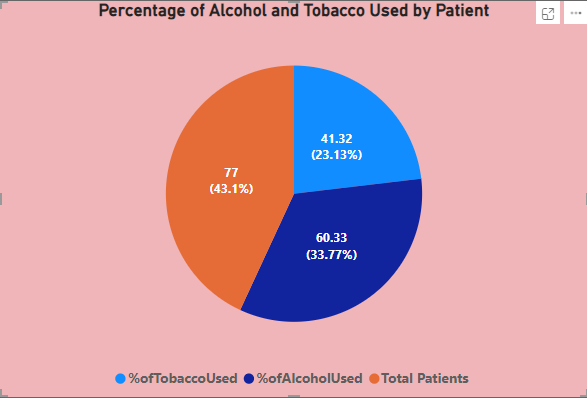
Use Case: Track alcohol and tobacco consumption levels in diabetic patients, comparing them with health guidelines to assess whether intervention is needed.

7. Tree Map
Hierarchical data is depicted using nested rectangles in a tree map, with the size and color of each rectangle representing the amount and category.
When to Use:
Patient Demographics: Show the distribution of diabetic patients by age group or gender.
Health Metrics: Visualize proportions of patients within different health ranges, like glucose levels.
Types of Treatment: List the most popular drugs or therapies for diabetes.
Issues: Imagine problems from diabetes, such as retinopathy or neuropathy.
Use Case: Display the distribution of patient visits by gender across cognitive score categories using a tree map.

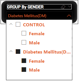
8. Slicers
A slicer is a filtering tool that lets users slice and filter data dynamically, making it easier to focus on specific insights.
When to Use:
Data Visualization: Create interactive dashboards where users can filter data easily.
Multiple Filtering Options: Apply multiple filters across categories in real time.
User-Friendly Interface: Allow non-technical users to explore data effortlessly.
Real-Time Data Analysis: Change filters in real time to get immediate insights.
Use Case: Filter a dataset by gender or patient group in a diabetes dataset.
These intermediate charts in Power BI offer more complex ways to visualize and analyze your data, adding interactivity and depth to your insights. Whether you’re comparing variables, analyzing trends, or exploring geographical patterns, these tools can enhance your data storytelling and help make informed decisions.
Final Dashboard Outlook:

D. Exploring Advanced Charts in Power BI
Advanced charts in Power BI allow for deeper data exploration and more interactive visualizations. These charts help users uncover complex insights and relationships between variables, making them ideal for analyzing detailed datasets. Let’s dive into some of the most powerful charts you can use!
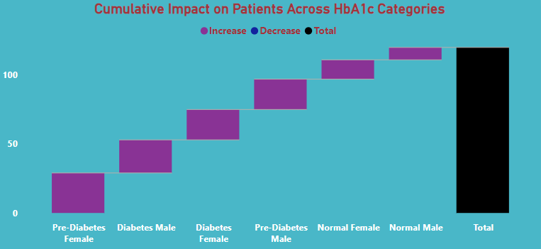
1. Waterfall Chart
A waterfall chart makes it simple to monitor the cumulative influence of data over time by illustrating how a sequence of positive or negative changes affects an initial number. The evolution is evident as each bar begins where the previous one finished.
When to Use:
Blood Sugar Levels: Track how factors like diet, exercise, and medication impact blood sugar levels over time. This helps in monitoring long-term trends and progress.
HA1C Levels: Show the effects of medication and lifestyle changes on HA1C levels, providing a clear picture of how well diabetes is being managed.
Weight Management: Visualize weight changes due to various lifestyle factors.
Impact of Complications: Display how complications like neuropathy or retinopathy progress.
Cost Analysis: See how different costs (like medication or doctor visits) contribute to total healthcare expenses.
Use Case: A waterfall chart is useful to analyze the impact of gender distribution across different HbA1c categories and help identify trends in diabetes management.
2. Decomposition Tree
A decomposition tree breaks down complex problems into simpler components, making it easier to analyze data across different dimensions and identify relationships.
When to Use:
Recognizing Risk Factors: Set diabetic risk factors in order of importance. Patient Segmentation: Sort patients into groups according to their health and demographic characteristics.
Treatment Plan Development: Design personalized treatment strategies.
Outcome Analysis: See how different treatments affect blood sugar levels.
Identifying Improvement Areas: Pinpoint lifestyle factors that need intervention.
Use Case: Use a decomposition tree to explore how patient demographics and health metrics like HbA1c and BMI relate to diabetes control.

3. Heat Map
A heat map visualizes data intensity using color gradients. Warmer colors (red or yellow) represent higher values, and cooler colors (blue or green) represent lower values.
When to Use:
Lab Test Results: Visualize correlations between tests like HbA1c and cholesterol levels.
Walking Gaits: Analyze variations in walking gaits among patients to identify potential complications.
Ophthalmology Findings: Map test results like retinopathy against demographic factors.
· Demographics: Determine patterns in blood pressure, glucose levels, and other variables according to factors including age and gender.
Cognitive Test Results: Visualize how cognitive scores impact diabetes management.
Use Case: Visualize how blood pressure ranges correlate with cognitive scores.
4. Key Influencers
The Key Influencers visual in Power BI helps you identify the factors that have the biggest impact on a specific outcome or metric in your dataset. It allows users to analyze trends, understand relationships, and pinpoint which variables drive performance or behavior. This tool is especially useful for exploring what influences key metrics, whether it’s customer behavior, performance indicators, or other critical data points, by visually highlighting both positive and negative impacts.
When to Use:
Identify Drivers: Understand what factors most influence an outcome.
Analyze Trends: Explore how trends affect key performance indicators.
Improve Decisions: Make informed choices based on influential factors.
Segment Data: Analyze how different groups influence an outcome.
Optimize Strategies: Refine strategies based on key insights.
Use Case: Identify how lifestyle factors influence BMI and HbA1c.

5. Combo Chart
A combo chart in Power BI combines two types of visualizations, typically a column chart and a line chart, in one display. It allows users to compare different but related metrics on the same axis, such as count of patient represented by columns and Age-group margin by a line. This helps in identifying trends and relationships in the data effectively.
When to Use:
Compare Related Metrics: Display two related metrics on the same axis.
Highlight Trends Over Time: Track trends and changes in the data.
Enhance Visual Clarity: Combine different scales for clearer comparisons.
Spot Patterns or Correlations: Compare trends and patterns across variables.
Use Case: To assess lifestyle behaviors across demographics, use a combination chart to track trends in alcohol and tobacco use (shown by a line) and visualize patient numbers across age groups (shown by columns).

With these advanced charts, you can uncover deeper insights from your data and go beyond basic visualizations. Whether you’re comparing complex variables, analyzing patterns, or identifying key factors, these visuals make data exploration more engaging and meaningful.
Final Dashboard Outlook

Choosing the Right Chart for Your Data
Use this quick decision matrix to match chart types to your data goals:
Comparison: Bar charts or column charts
Trends: Line charts
Proportions: Pie charts or donut charts
Relationships: Scatter plots or bubble charts
Progress: Gauge charts or waterfall charts
Pro Tips for Stunning Power BI Visualizations
1. Define the Purpose
Start with a clear goal—are you comparing data, analyzing trends, or highlighting key insights?
2. Keep It Simple
Use minimal colors, avoid clutter, and focus on the essentials.
3. Leverage Interactivity
Add slicers and filters to allow users to explore data dynamically.
Common Pitfalls to Avoid
Too Much Data: Avoid overloading dashboards with excessive information.
Wrong Chart Types: Match the visual to the data for clarity.
Neglecting Accessibility: Ensure readability, contrast, and mobile compatibility.
Conclusion: Key Takeaways
Effective Power BI visualizations are characterized by their simplicity and clarity.
Select the type of chart that best suits your data and message.
Keep experimenting and refining your skills to make your visuals stand out.