_edited_edited.png)


Pareto charts are an excellent tool for conducting 80/20 analysis in Tableau, helping to identify the key contributors to the majority of outcomes. Whether you are a beginner or an advanced user, this guide will provide all the steps to create and customize Pareto charts for deeper insights.
What is a Pareto Chart?
A Pareto chart is a combination of a bar chart and a line chart based on the Pareto principle (or 80/20 rule), which suggests that 80% of effects come from 20% of causes.
Bars: Represent individual categories (e.g., products, regions) and their contribution to the total.
Line: Displays the cumulative total of these contributions, highlighting the increasing impact of each additional category.
Simple Example:
Imagine analyzing sales by product category:
Product A: 40% of sales.
Product B: 30% of sales.
Product C: 15% of sales.
Others: 15% of sales.
In this case, the Pareto chart would show taller bars for Products A and B, and the cumulative line would indicate that these two products account for 70% of total sales.
Steps to Create a Pareto Chart in Tableau
1. Add Dimension to Columns and Measure to Rows:
Drag the dimension (e.g., product, region) to the Columns shelf.
Drag the measure (e.g., sales, profit) to the Rows shelf.
2. Sort in Descending Order:
Click the descending sort button to order the dimension by the highest measure value.
3. Add the Measure Again to Rows:
Drag the same measure again to the Rows shelf. This will generate the cumulative line chart.
4. Apply Table Calculation:
Right-click the second measure on the Rows shelf and select Add Table Calculation.
Choose Running Total to generate the cumulative values.
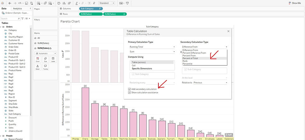
5. Add Secondary Calculation:
Right-click on the same second measure and select Edit Table Calculation.
Check the box for Secondary Calculation and select Percent of Total.
6. Set Dual Axis:
Right-click on the second measure and select Dual Axis to overlay the cumulative line chart on the bar chart.
7. Change Chart Types:
For the first measure, set the chart type to Bar.
For the second measure, set the chart type to Line.
8. Add Labels:
For the line chart, Drag the measure (in the data pane) to the Label on the Marks card to display the values for each category.
9. Apply Table Calculation to Labels:
For the line chart, Right-Click the measure in the Label on the Marks card and apply the same Running Total and Percent of Total calculations.
10. Edit and Adjust Labels:
Format labels to display the dimension, measure, and cumulative percentages for better clarity.
Example : Sub-category vs. Sales
1. Add Sub-category to Columns and Sales to Rows:
Drag Sub-category to the Columns shelf.
Drag Sales to the Rows shelf.

2. Sort Sub-category in Descending Order:
Click the descending sort button to order the Sub-category by the highest Sales value.

3. Add Sales Again to Rows:
Drag Sales again to the Rows shelf to create the cumulative line chart.

4. Apply Table Calculation:
Right-click the second Sales pill in the Rows shelf and select Add Table Calculation.
Choose Running Total as the calculation type to calculate cumulative Sales.

5. Add Secondary Calculation:
Right-click the second Sales pill, select Edit Table Calculation, and check the box for Secondary Calculation.
Set the secondary calculation to Percent of Total, which calculates the cumulative percentage of Sales.
6. Set Dual Axis:
Right-click the second Sales pill and select Dual Axis to overlay the cumulative line chart on the bar chart.

7. Change Chart Types:
Set the first Sales measure to Bar and the second Sales measure (cumulative percentage) to Line.


8. Add Labels:
For the line chart, Drag Sales (in the data pane) to the Label on the Marks card to show the sales values.

9. Apply Table Calculation to Labels:
For the line chart, Right-Click SUM(Sales) in the Label on the Marks card and apply Running Total and Percent of Total calculations to display cumulative percentages.


10. Edit and Adjust Labels:
Format the labels to display Sub-category, Sales, and cumulative percentages, ensuring that they are clear and not overlapping.


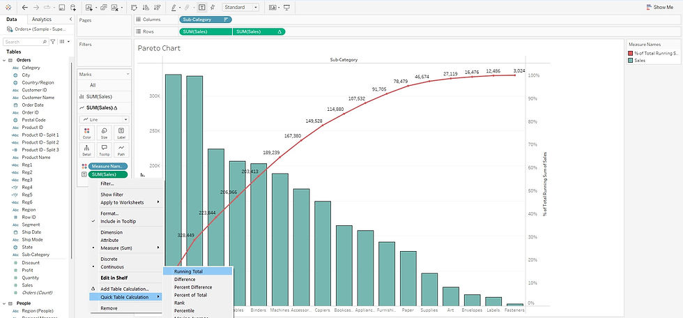
The bars in the Pareto chart represent the sales of individual sub-categories, while the line chart shows the cumulative percentage of sales as the sub-categories are added up across the x-axis. This helps visualize the contribution of each sub-category to the total sales, with the line indicating how the cumulative total grows as more sub-categories are considered.
The Pareto chart helps you quickly identify which sub-categories contribute the most to overall sales. According to the 80/20 rule, 80% of the sales usually come from just 20% of the sub-categories. By analyzing the chart, you can easily spot the key sub-categories driving most of the sales, allowing you to make informed decisions and focus your efforts where they will have the biggest impact.
Advanced Customization Tips
Add Filters: Filter by time, region, or other dimensions to narrow your analysis.
Color Coding: Differentiate high-contributing categories by applying color to bars.
Multiple Dimensions: Add additional dimensions such as customer segments or regions for deeper analysis.
Enhanced Labels: Add exact values or cumulative percentages on each bar and along the cumulative line.
Pareto charts in Tableau are a powerful tool for identifying the factors that contribute the most to a result, enabling you to focus on what truly matters. Whether you are conducting sales analysis, operational performance review, or customer segmentation, Pareto charts make it easy to pinpoint the critical few contributors.
Comments