_edited_edited.png)
Histograms are a fundamental tool in data visualization, offering a clear picture of how numerical data is distributed. Whether you're new to Tableau or an experienced user, understanding histograms can significantly enhance your ability to analyze data patterns. In this guide, we’ll cover everything you need to know about histograms in Tableau, from creating one to adjusting bin sizes and addressing common questions.
What is a Histogram?
A histogram is a specialized bar chart that helps visualize the distribution of a single measure. It divides the measure into intervals known as bins and displays how many data points fall into each bin. The height of each bar in the histogram represents the frequency of data points within that bin.
Key Concepts in Histograms
Bins: These are the intervals that group your data. For example, if you're analyzing sales and set a bin size of $5,000, your sales data will be grouped into ranges like $0-$5,000, $5,000-$10,000, and so on.
Bars: The bars show the number of data points within each bin. The height of each bar indicates how many points (e.g., sales transactions) fall into that specific range. Taller bars mean more data points in that range, while shorter bars indicate fewer data points.
Steps to Create a Histogram in Tableau
Creating a histogram in Tableau is a simple process. Here’s how to do it:
Connect to Your Data Source: Open Tableau and connect to your dataset. Make sure your data contains at least one measure you want to analyze, such as Sales, Profit, or Quantity.
Drag the Measure to Columns or Rows: Select the measure you want to analyze (e.g., Sales). Drag it to either the Columns or Rows shelf. For instance, if you drag Sales to the Columns shelf, Tableau will start preparing the visualization.
Choose the Histogram Chart Type: After placing the measure, go to the Show Me panel on the right and select Histogram. Tableau will automatically generate bins for the measure and create a basic histogram.
Adjust the Bin Size (Optional): Tableau sets a default bin size, but you can adjust it based on your analysis needs. To change the bin size:
Find the bin field Tableau created in the Data pane.
Right-click on the bin field and select Edit.
Specify a new bin size in the Edit Bins dialog box. For example, if the default bin size is $10,000, you can change it to $5,000 for more granular analysis.
Click OK, and the histogram will update accordingly.
Customize the Histogram: Enhance your histogram by:
Adding labels to show the count of data points in each bin.
Changing the colors for better visual clarity.
Using the Marks card to adjust how the bars are displayed.
By following these steps, you can create a histogram and customize it to suit your analysis needs.
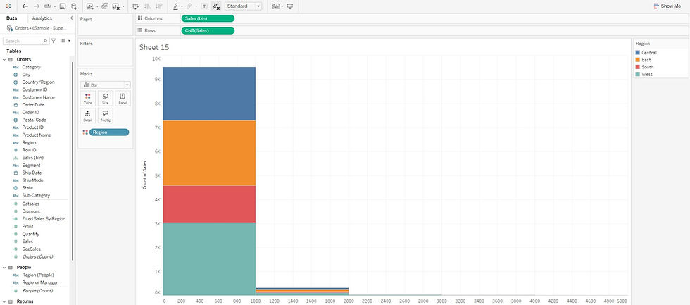
Example Scenario: Analyzing Sales Data Distribution
Imagine you’re analyzing sales data for an online retail company, and you want to understand region-wise sales distribution, then do the below:
Connect to Your Sales Data: Open Tableau and connect to your company’s sales data.
Drag the Sales Measure to Columns or Rows: Drag the Sales measure to the Columns or Rows shelf. Let’s say you drop Sales into the Columns shelf.

Choose the Histogram Chart Type: In the Show Me panel, select the Histogram option. Tableau automatically creates bins for the sales data and generates the histogram.

Review and Adjust the Bin Size (Optional): The default bin size might be $500.

But if you want more detail, right-click the bin field, choose Edit, and set the bin size to $250. The histogram will now show more bars, each representing sales intervals of $250, giving a more detailed view.


Conversely, if you set the bin size to $1000, the histogram will display fewer bars, with each bar representing a broader sales interval of $1000, providing a more summarized view of the data.

Customize the Histogram: Add labels to the bars to show the exact count of sales in each range. You can also color the bars by Region to explore geographic sales patterns.
By examining this histogram, you can adjust your sales strategies, tailor your approach to different customer segments, and optimize pricing and promotional efforts accordingly.
Important Considerations When Creating Histograms
How Many Measures Are Needed? A histogram only requires one measure. It focuses on the distribution of this single measure across defined bins.
Is a Dimension Needed? No, dimensions are not necessary to create a histogram. However, you can use dimensions to segment the data within the histogram. For example, adding Product Category as a color will show how sales are distributed across different product categories.
Impact of Bin and Bar Sizes
Smaller Bins: More detail with narrower intervals, but the histogram might appear more complex.
Larger Bins: Broader intervals simplify the histogram, but you may lose finer details.
Tall Bars: Indicate a higher frequency of data points in that bin, showing that many values fall within that range.
Short Bars: Show a lower frequency of data points, indicating fewer values in that range.
Conclusion
Histograms are essential for understanding the distribution of numerical data in Tableau. Whether you’re a beginner or an advanced user, knowing how to create and customize a histogram can unlock deeper insights from your data. By adjusting bin sizes, customizing bar displays, and using dimensions to segment data, you can tailor your histogram to meet your specific analytical needs.
With the skills outlined here, you’re now equipped to confidently build effective histograms in Tableau that enhance your data storytelling and decision-making.