_edited_edited.png)
Funnel charts are highly versatile and effective visualizations in Tableau, used to show progressive data through stages—typically narrowing down as values decrease. Whether you’re a beginner or an advanced Tableau user, this guide will take you through everything you need to know about funnel charts, including when and how to use them.
What is a Funnel Chart?
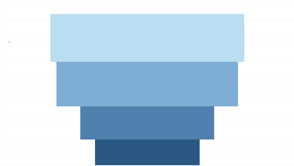
A funnel chart is a type of visualization that helps you see how data progresses through different stages, with each stage having a smaller value than the one before. Here’s how it works:
Stages: Think of it like a real funnel used in cooking or chemistry. The chart starts wide at the top and gets narrower as you go down. Each level or stage in the funnel represents a different part of a process.
Width Represents Value: The width of each segment in the funnel represents the size of the value. For example, if you’re tracking sales, the top stage might show all the leads you started with, and the stages below will show how many leads moved on to the next steps, getting narrower as fewer leads make it through.
Finding Drop-Offs: Funnel charts are great for spotting where you’re losing people or opportunities. If many people drop out at a certain stage, it will show as a sharp narrowing at that point in the funnel.
Simple Example:
Imagine you’re looking at how people move through a buying process:
Top Stage (Leads): Start with 1,000 potential customers.
Middle Stage (Interested): 500 of them show interest.
Bottom Stage (Sales): Finally, 100 of them make a purchase.
In the funnel chart:
The top of the funnel is wide, showing 1,000 leads.
The middle section narrows down to show 500 interested customers.
The bottom narrows even more to show 100 sales.
How to Interpret the Funnel Chart:
Drop-Off Points:
Visual Drop-Off: The funnel chart visually illustrates where the most significant reductions happen. You can easily see that the funnel narrows from 1,000 initial leads to 500 interested leads and then to 100 sales. This clear visual helps identify where you lost the most potential customers.
Process Effectiveness:
Identify Bottlenecks: The funnel chart shows you which stages are most effective and which need improvement. For instance, if the funnel narrows significantly between initial leads and interested leads, it indicates a major drop-off that might need attention in your engagement process.
Analyze Conversion Rates: You can also calculate conversion rates between stages. For example, 50% of the initial leads became interested (500 out of 1,000), and 20% of the interested leads converted to sales (100 out of 500). This helps evaluate how well each stage is performing.
Common Steps to Create a Funnel Chart in Tableau:
Connect to Your Data Source:
Open Tableau and connect to your data source. Ensure your data includes both a measure and a dimension.
Drag Your Measure to Rows:
Drag your measure to the Rows shelf. This will represent the value for each stage of the funnel.
Drag Your Dimension to Columns:
Drag your dimension to the Columns shelf. This will define the different stages or categories in your funnel chart.
Use the Marks Card for Size and Color:
Size: Drag the measure to Size (not the one in the row shelf, You need to drag and drop the measure from the data section) on the Marks card. This controls the width of each segment in the funnel chart.
Color: Drag the dimension (from column shelf) to Color on the Marks card. This will color-code each stage or category.
To ensure you see the complete funnel view, choose the option "Entire View" from the "Standard" drop-down menu. This setting will adjust the chart to display the entire funnel, allowing you to view all stages without truncation.
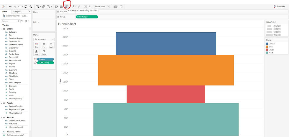
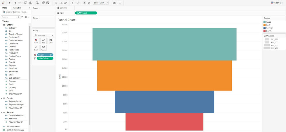
Sort in Descending Order:
Click the Descending Sort button above the Columns shelf and sort the funnel chart in descending order of the measure. Sorting in descending order is essential for creating a proper funnel shape.
Note: Only sorting in descending order creates the correct funnel shape. If sorted in ascending order, the chart will not show the typical funnel appearance.
Example: Regional Sales Funnel Based on Sales
This example shows how you can visualize regional sales using a funnel chart. Each stage represents a different region, and the width of each segment represents the total sales for that region.
Drag Sales to Rows:
Use SUM(Sales) to represent the total sales across regions.
Drag Region to Columns:
This will break down your sales data by region.

Drag Sales (from data section) to Size and Region (from column shelf) to Color:
This will adjust the funnel width and color-code each region.


Change view from "Standard" to "Entire View".

Sort in descending order of Sales to create the funnel shape.
Advanced Customization Tips:
Add Labels: You can add text labels to show the exact values for each stage by dragging the measure to the Label shelf in the Marks card. Be cautious when adding labels to prevent overcrowding.

Adjust Whitespace: Minimize space between stages by right-clicking the Size field in the Marks card and adjusting the slider to fine-tune the appearance.
Multiple Measures or Dimensions: You can further analyze data by adding additional measures or dimensions (e.g., comparing sales by region and product category). Simply drag them into the Rows, Columns, or Color shelves to break down your data further.

Funnel charts are a powerful tool for tracking progressive data and identifying drop-offs at each stage. By ensuring your funnel is sorted in descending order and following best practices—such as using measure for Size and dimension for Color—you can effectively visualize key metrics across different stages. Whether you're analyzing how quantities change across various categories or evaluating performance across different segments, funnel charts in Tableau provide a clear and effective way to present your data.
With the steps outlined here, both beginners and advanced users can confidently create and customize funnel charts to meet their data analysis needs.