Harnessing the Power of Tableau: Switching Between Chart Types with Parameter
Tableau is widely recognized as a powerful data visualization tool that empowers users to transform raw data into meaningful insights. Its intuitive interface and robust capabilities make it a go-to platform for professionals seeking to create visually engaging and informative dashboards. From basic bar charts to intricate multi-dimensional analyses, Tableau provides the tools necessary to simplify complex datasets and present them in ways that are easy to interpret and act upon.
One of Tableau's standout features is its flexibility in creating and customizing visualizations. Users can seamlessly switch between different chart types, allowing them to tell a story in the most effective and impactful manner. This adaptability is especially useful when analyzing data from multiple angles or presenting findings to varied audiences. With just a few adjustments, you can shift your perspective from a high-level overview to a detailed breakdown within the same dashboard.
One advanced feature that highlights Tableau's interactivity and customization capabilities is the ability to switch between chart types using parameters. This functionality not only enhances user experience but also provides viewers with the freedom to explore the data in a way that resonates with their unique needs and questions.
In this blog, we’ll explore how you can leverage parameters in Tableau to switch between chart types dynamically. This technique allows you to offer multiple visualization options within a single dashboard, empowering end-users to interact with the data in a more meaningful and personalized way.
Why Parameters Matter in Tableau
Parameters in Tableau act as placeholders for a single value, which can be dynamically updated based on user input. These inputs can influence calculations, filters, or even visualizations, providing a level of interactivity that enhances the overall dashboard experience.
By linking parameters to chart types, you enable users to select their preferred visualization with just a few clicks. This is particularly beneficial in scenarios where data needs to be presented in various forms, such as:
High-Level Summaries: Bar charts or pie charts for quick overviews.
Trend Analysis: Line charts display data trends over time.
Detailed Comparisons: Scatter plots or heatmaps or Map for deeper insights.
The ability to toggle between these views ensures that the dashboard caters to diverse analytical needs while maintaining a clean and organized design.
I have used Sample Super Store data as sample data to explain about the techniques to switch between charts.
In this guide, we’ll walk through the step-by-step process of creating three types of charts—Bar Chart, Line Chart, and Map Chart—using Tableau. Additionally, we’ll demonstrate how to use parameters and calculated fields to dynamically switch between these charts on a dashboard for an interactive user experience.
Step-by-Step Guide: Switching Between Chart Types Using Parameters
Set Up Your Data
Before diving into parameter creation, ensure the data is well-structured and ready for analysis. Connect your data source to Tableau, clean the data if needed.
Chart Creation
1. Bar Chart
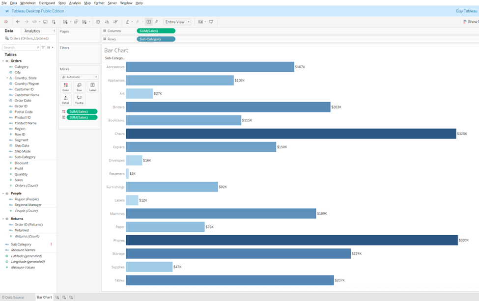
a) Setting Up the Bar Chart: To begin, we need to create our first chart—the bar chart. Start by creating a new sheet in Tableau. Name this sheet "Bar Chart."
Drag Sub-Category from the data pane and drop it into the Rows shelf. This will represent the categories of products.
Next, drag Sales to the Columns shelf. This will plot the sales for each sub-category, and Tableau will automatically generate a bar chart. The length of each bar will correspond to the sales for that particular sub-category.

b) Enhancing the Chart: Once the basic bar chart is created, it’s time to make it more informative and visually appealing.
To make the sales figures more visible, drag Sales again to the Labels shelf. This will display the exact sales numbers on top of the bars.
Now, to differentiate the sales values visually, drag Sales to the Colors shelf. This will assign a color gradient to the bars based on the sales values.
By default, Tableau uses a color palette, but we can customize it later if desired. For now, we will stick with the default color scheme for simplicity.


c) Formatting the Chart: Formatting helps improve readability and aesthetic appeal.
Right-click on the Sales label and choose Format from the context menu. This will open the formatting options.
Select Number Format and choose Currency (Custom) to format the numbers as currency. Set the Decimal places to 0 to avoid showing cents.
Change the Display unit to Thousands (K) so that the sales figures are displayed in a more concise format, especially when dealing with large numbers.
Next, we’ll remove the gridlines, which can make the chart look cluttered. To do this, go to the Format menu, select Format Lines, and under Grid Lines, set the option to None. This will give the chart a cleaner look by removing unnecessary lines from the background.


d) Final Touches: We can further simplify the chart by removing unnecessary axis labels.
Right-click on the axis and choose Remove Header. This will eliminate the axis labels, leaving only the bars, making the visualization look cleaner and more streamlined.
Now, your Bar Chart is ready to use!
2. Line Chart
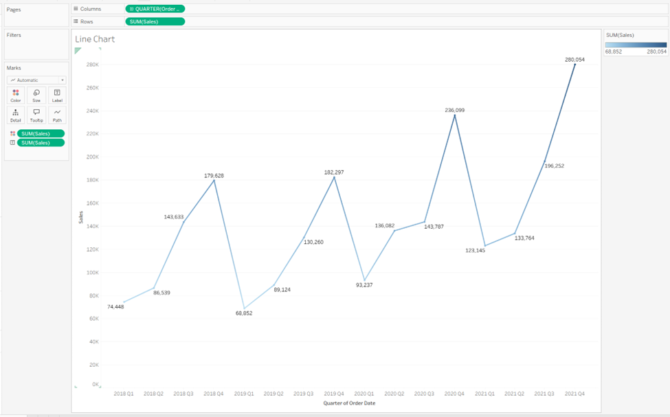
a) Setting Up the Line Chart: Let’s move on to the second chart—Line Chart. Again, create a new sheet and name it "Line Chart."
Drag Order Date to the Columns shelf and set it to display by Quarter. To do this, click on the drop-down arrow of Order Date and select Quarter from the options. Choose a specific quarter, like Q2 2015, to view sales trends for that period.
Drag Sales to the Rows shelf. This will generate a line chart that shows how sales have changed over time. Each point on the line represents sales in a particular quarter.


b) Enhancing the Chart: Now, let’s make the chart more informative by adding additional visual cues.
Just like in the Bar Chart, drag Sales to the Labels shelf. This will display the exact sales value at each point on the line.
To visually differentiate the sales values, drag Sales to the Colors shelf. This will apply a color gradient along the line, indicating higher or lower sales depending on the values

c) Formatting the Chart: Formatting ensures that the chart is easy to read and looks polished.
Right-click on the Sales label and select Format.
Change the Number Format to Currency (Custom), set the Decimal places to 0, and choose the Display unit as Thousands (K).
Again, remove the gridlines to give the chart a cleaner look. Go to Format Lines, and set Grid Lines to None.


d) Final Touches:
To clean up the chart, right-click on the axis and select Remove Header. This removes unnecessary labels, giving the chart a more polished appearance.
If a card is showing on the sheet (such as a legend or filter), right-click on it and choose Hide Card to remove it from view.
Your Line Chart is now complete!


3. Map Chart
a) Setting Up the Map Chart: Next, let’s create the Map Chart. This chart type helps us visualize data across different geographical regions.
Create a new sheet and name it "Map Chart."
Drag Country to the Details shelf to plot data across different countries. Then, drag State to the Details shelf as well to display state-wise data.
Drag Sales to both the Label and Color shelves. This will show the sales figures for each state and color-code them based on sales volume. The darker shades indicate higher sales, and lighter shades indicate lower sales.


b) Formatting the Chart: To ensure the map looks professional:
Right-click on the Sales label and select Format. Use the same formatting options as before: Currency (Custom), Decimal places set to 0, and Display unit set to Thousands (K).
As with the previous charts, remove the gridlines by going to Format Lines and setting Grid Lines to None for a cleaner visual presentation.


c) Final Touches:
Right-click on the axis and select Remove Header to streamline the chart’s appearance.
Now, your Map Chart is ready to use!

Creating a Parameter for Chart Selection
Step-by-step Creation of a Parameter: To allow users to toggle between the three charts, we need to create a parameter.
Go to the Data Pane and click the dropdown arrow. Select Create Parameter.
In the Create Parameter dialog box, name the parameter "Select a Chart Type".
Change the Data Type to String, which allows us to use text values.
Select the List option under Allowed Values and add the names of the three sheets: Bar Chart, Line Chart, and Map Chart. This will let the user choose from these three chart types.
Click OK to create the parameter, which will now be visible in the Parameters section of the Data Pane


Creating a Calculated Field for the Parameter
Now, let’s create a calculated field to utilize the parameter:
In the Data Pane, click the dropdown arrow and select Create Calculated Field.
Drag the newly created Select a Chart Type parameter into the calculated field.
Name this field "Select Chart Type" and save it. This field will now appear in the Data Pane, and we can use it to control which chart is displayed.


Integrating Parameters into Sheets
For each chart sheet:
Now, we’ll link the parameter to each chart sheet:
In each sheet (Bar Chart, Line Chart, and Map Chart), right-click the Select a Chart Type parameter and select Show Parameter. This will display the parameter control next to the chart
Ensure the parameter dropdown displays all three options (Bar Chart, Line Chart, Map Chart).


Set the default selection for each sheet:
In the Bar Chart sheet, set the parameter to "Bar Chart."
In the Line Chart sheet, set the parameter to "Line Chart."
In the Map Chart sheet, set the parameter to "Map Chart."


Add the Calculated field into the Filter Pane for all the three sheets.

Building the Dashboard
Now let’s combine all the work into a dashboard:
Create a new dashboard and name it "Chart Type."
Set the dashboard size to Automatic, ensuring it adapts to different screen sizes.
Add a Horizontal Container to the center of the dashboard.
Drag the Bar Chart into the container and set it to fit the Entire View.
Add the Line Chart next to the Bar Chart. You can test the functionality by selecting "Line Chart" from the parameter dropdown to switch between the charts.
Add the Map Chart next to the Line Chart and test it by selecting "Map Chart" from the dropdown.
To clean up the layout, right-click on each chart and select Hide Title. This will remove the individual chart titles and ensure all three charts are aligned seamlessly


Adding Charts:
Drag the Bar Chart into the container and set it to fit the Entire View.
Drag the Line Chart next to the Bar Chart. Test the functionality by selecting "Line Chart" from the parameter dropdown.
Drag the Map Chart next to the Line Chart and test the functionality again.


Final Touches:
Right-click on each chart and hide the chart titles to create a unified layout.
Add a Text Object at the top of the dashboard with the title "Select Chart Type Using Parameter


In this blog, we’ve walked through the process of creating three powerful Tableau charts and combining them into a dynamic, interactive dashboard. By using parameters and calculated fields, we’ve empowered the user to toggle between the Bar Chart, Line Chart, and Map Chart, enhancing the user experience.
Now, with just a few clicks, you can switch between different types of visualizations and gain insights from your data in a much more interactive way. Whether you’re an analyst, a data scientist, or a beginner, these skills can help you create professional-looking dashboards that are both functional and visually appealing.
Tada! Your interactive dashboard is now ready to impress!


Here's a short video showcasing the final result of switching between charts. Enjoy exploring and happy chart toggling!
_edited_edited.png)