_edited_edited.png)
Hello Readers, we feel pleasant emotions such as satisfaction, pride and joy when we learn something new. Trying new things in Tableau makes me rewarded. I will demonstrate an easy way to create an Orbit chart in tableau. It can make you feel confident, excited and inspired, after you learn the advance chart in Tableau.
What is an Orbit chart?
An Orbit is the route in which an object in space moves around another in a circular motion. An orbit chart is also known as Satellite in Tableau which displays a percentage figure.
A satellite chart shows the size of a satellite in orbit that includes the data volume and percentage of the field. An orbit chart is created by layering many satellite charts together. As a result, Orbit Chart is considerably simple and well-structured; rather than requiring multiple charts.
Let’s get started with data set.
Connect to the data set, make sure the data set filtered and formatted properly.
To create orbit, we need a path bin. We can add path field in the dataset without using external excel file.

Join the data set using union (drag the dataset under the dataset. Orange color Union box will appear, drop the dataset on the union)
Once the union is created with same dataset, a new field called Table name is added with the value of Dataset name in all the rows.
We can create a path using Table Name filed in calculated field.
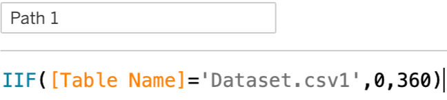
Now path is created with two values (0 and 360).

Path(bin) helps to spread the data between start and end points (0 and 360). Click the down arrow in the path field and edit the size of bins as 1 and click ok.
Create a calculated field for Orbit Chart:
1.Index: INDEX ()-1
2.Size Calculated Filed:
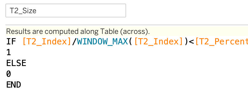
I create a percentage calculated field for Size.
[Total count] / [total Patient]
In Total count, used WINDOW_SUM ([Sepsis Count])/2 .
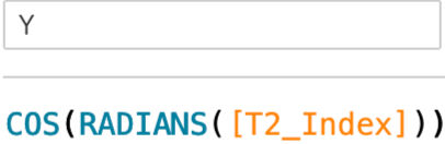
3. X Calculated Field: 4. Y Calculated Field:

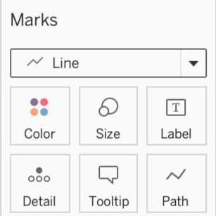
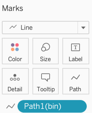
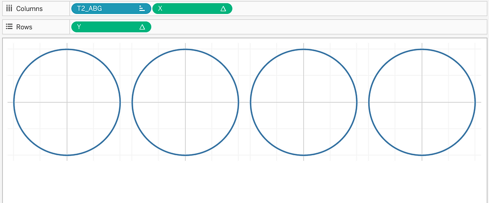
After creating calculated fields for X and Y axis, change the Marks card to line. Drag and drop the Path(bin) into Path in the Marks card.

To plot the graph, drag and drop the X calculated field to the columns along with category calculated. Drag and drop the Y calculated filed to the rows. Right-click on X in the column and compute using Path(bin). Right click on Y in the rows and compute using Path(bin). After compute using path(bin), circles are created.
Here I chose ABG category for my Orbit chart.
What is ABG?
An Arterial blood gas analysis measures the balance of oxygen and carbon dioxide in blood to see how well lungs are working.
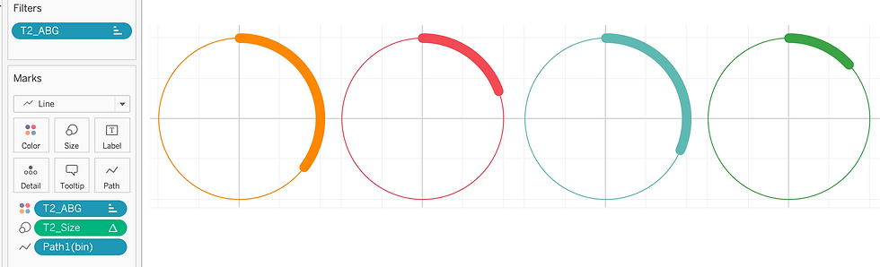
I dragged and dropped the ABG category calculated field into the columns. Put the ABG category field in Color under the Marks. The color of the circles change based on the category.


Next step is drag and drop the size calculated field in the Size under Marks card.
Right-click the size calculated field into the Size under the Marks, choose compute using Path(bin).
Again, right-click the size calculated field, click edit Table Calculation. Select Specific Dimensions. Check ABG category calculated field. Based on the selection of the dimension, the size of the circle's orbit change.
The chart will look like the below image.
Now Orbit chart is ready to format.
I created a dummy axis called "zero". Put the zero axis into rows. Click on down arrow and select Dual Axis to merge zero and Y axis. Under Marks, click zero axis and remove ABG category from Color. Remove all the measure values in zero axis under the Marks. The purpose for creating a dummy axis is to give an elegant look for the chart. We can add the information later in the label in zero axis under marks card. But it is optional.
Customize the colors and the size of the marks. Remove the gridlines for better appearance. It is done by using format in tool bar. Click Toolbar->Format->Lines.
On the left-side of the window, the format will open. Select ‘None’ for Grid lines and Zero lines. All the lines in the chart will disappear.
Right click on the X and Y axis and remove the Show Header by deselecting it.
Add the ABG Category and Sepsis count to the Label in zero axis under the Marks cards. Change count into percentage.
Final step is adding the required information in Tooltip under the Marks card and, or remove the unwanted information like path(bin), x axis from Tooltip. All the information in ToolTip will display when hovering inside the Orbit.

This is the final outcome of an Orbit chart that shows Arterial Blood Gas analysis of the Sepsis Patients.

In Conclusion, getting a better chart is a goal for all the Tableau users. This demonstration will aid to create an Orbit chart in an easy and more understandable manner. An Orbit chart when mastered can be presented in a clean and neat fashion. I am happy to show my visualization and I trust that it would help you to create a wonderful Orbit chart.
Thank you….