In general, bar charts are flexible and versatile tools .It is widely used across different domains like business, finance, science, and social sciences because they are simple yet powerful in communicating information effectively.When I was doing my first project in Tableau first thing I created was a bar chart and was eager to do different kind of bar chart at that time I came across 3D bar chart and want to share my learnings.
Let’s walk through the steps to create a 3D bar chart.
A 3D bar chart used to represent categorical data, which consists of dimensions representing qualitative attributes rather than quantitative values.It utilizes of rectangular bars, where the length or height of each bar corresponds to the count, percentage or value of the category it represents.The x-axis of a 3D bar chart typically represents dimensions , while the y-axis represents measures like count, percentage or values associated with each dimension.3D Bar charts can be directed vertically or horizontally depending on the need.
3D bar charts are particularly useful for:
Comparing Different Categories: For example ,In superstore data you want to compare region wise profit over time.
Highlighting Differences:For example ,In superstore data you want to compare region wise profit over time and need to find which region has highest profit.
Visualizing Distributions: For example ,In superstore data you want to compare region wise sales and profits over time.
Easily understandable :Once created, 3D bar charts are easy to interpret and give out more information than many other charts.
Since we know the importance of the bar chart,Now let’s see how to create the visual in 3D format .Here we achieve this using data densification technique.
What is Data Densification?
Data Densification is something more interesting and fascinating in tableau.
With this technique we can create many advanced chats like sankey,radial,dendrogram.
Data densification involves creating additional data points, typically along the X-Y axis, to fill gaps in the dataset and create a denser representation of the data.This process helps to create smoother or more continuous visualisations.With Data densification we can make lines and different types of curves and circles.
Now, let’s explore the steps involved in creating the 3D bar chart.
DATA
Setting up the datasource:
Step 1:Load the superstore Dataset into the tableau.
Step 2: Copy the values 0 100 as below and paste it in the data source tab ,then automatically clipboard will be created.This step is used for data densification from 0 to 100 as a data point.This is achieved using the left outer join with the dataset.
0
100
Clipboard is created

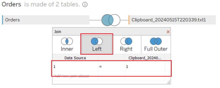
After Successfully creating the clipboard we need to do a left outer join with the “Orders” table.
Step 3:Drag the Orders table to the center pane and double click to go to the physical layer.
Step 4:Drag Clipboard and make the connection with the Orders table. We may encounter the error as there is no common column to join . So ,click on Add new join clause, go to Create Join Calculation, type 1 and click OK.Do the same on other side also.You should get same as below

Calculated Fields:
Once we are done with the above steps.We are going to create the Bin and Calculated Fields.
Clipboard
Right-click on Clipboard, go to Create and select Bins.
In the Edit Bins dialogue window:
Set New field name to Clipboard(bin).
Set Size of bins to 1.
Click Ok.
Index — This densifies the data from 100 to 0
100-Index()
Percent_profit — Calculate the percentage of profit for each region.
(SUM([Profit]) / TOTAL(SUM([Profit]))*100)
Max_value — This gives you the height of the bar.
WINDOW_MAX(([Percent_profit]))
Y_axis_rows — This gives you the data point along the Y axis starting from Max_value to zero. This is where the data densification is happening by generating additional data points.
IF [Index] <= [Max_value] THEN
[Index]
ELSE
NULL
END
Now Calculation part is done, let’s move on to the exciting part ,creating the visual.
Worksheet
REGION WISE PROFIT PERCENTAGE :
Step 1: Change the Mark Type to Shape.
Step 2:Drag Region onto the Columns Shelf.
Step 3: Drag Region onto the Shape in Mark Shelf.
Step 4: Drag Clipboard(bin) onto Columns Shelf.
Step 5:Right-click on this object and ensure that Show Missing Values is selected.

Step 6:Drag this object Clipboard(bin) onto the Detail Mark.

Step 7:Drag the Y_axis_rows onto the Rows Shelf.
Step 8:Right-click on Y_axis_rows , go to Compute Using and select Clipboard(bin).

Step 9:Right-click on Y_axis_rows , go to Edit Table Calculation.
Do the following set up: Select Max_value -> Clipboard

Select Index-> Clipboard

Select Percent_profit-> Region

After all these steps,you should have a similar chart as below.

We have now created our Shaped Bar Chart,you have to download the cubes shapes from the internet and save it in the Shape Repository.Shape Repository can be found inside My tableau Repository. I have attached a sample cubes for reference
Shape Repository Location — “Documents\My Tableau Repository\Shapes”,save your downloaded shapes here.
Once cubes are in the Shapes Repository, we will make our 3D chart.
Hide the Axis Headers.
In the Mark Shelf ,assign our Cube Shapes to each Region.
Click on the nulls and select Filter.
Put the Percent_profit to Labels.
If all goes well, we have our 3D chart ready!!!

Conclusion:
In summary,3d Bar charts are powerful tools for visualizing categorical data. It helps to get the insights easily with the complex dataset. Data densification technique used to create the smoother and and more continuous graphs. By mastering the art of data visualization empowers you to tell compelling stories with your data.
_edited_edited.png)