In this analysis, we will predict the flights fare for each month by using the historic data. The dataset contains the fare of various flights to conduct the statistical analysis to get meaningful information. The dataset details the passengers who have traveled on flights across India. A thorough study of the data will help make predictions and provide value to the passengers. The main aim is to find various questions which will help resolve the issues such as price varying, the fare charges just before one or two days, the ticket fare based on arrival and departure time, and price changes with the change in source and destination. By solving all these questions, we can make better predictions. We can understand the essential insights for better decision-making using business intelligence concepts. After analyzing the data, we can make decisions for the business's profit.
We will use the jupyter notebook tool. The dataset contains attributes such as the airline's name, journey date, source, destination, and price. After collecting the dataset, we will perform data cleaning. Data cleaning is the cleaning of the data to make data more valuable. In data cleaning, we will check for missing values, remove unnecessary data, find hidden values, remove outliers, and remove the null values. After analyzing the data, we will find that the dataset contains various null and missing values, which we will remove to clean the data.
Below are the following visualizations for predicting the fares-
Figure 1 shows the price and month comparison of the dataset. In this graph, we will find more bookings in May and April with fewer bookings than others. This can be due to: Summer vacations in the month of may for schools/colleges, hence most families are also generally going on vacations around this time. The count of flights is lowest in April, which can be because Schools and colleges have their final exams around this time; offices are primarily busy in April as it is the end of Quarter 1.
To check the price and month comparison, we create a bar graph and visualize the fares of each month. We take price and month of booking the tickets.


Figure 2 shows the count of flights with different airlines. This graph shows Jet Airways' fare is more than the other airlines. Apart from the first airline, almost all have similar median.
To check the counts of flights with different airlines, we can use the airline fare and count of flights from the dataset through which we can get the fares of each airlines.

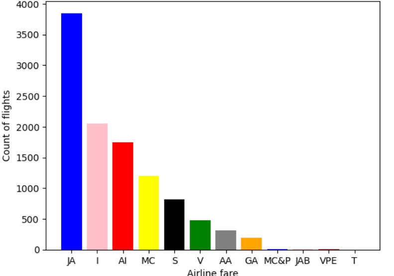
Figure 3 shows that the time of departure of the people whose time of departure is in the evening paid more than other passengers. Evening flight fares are expensive due to more demand and are the most convenient time to travel for most people.
To check the largest time of departure, we took the price and departure time details and we found that evening departures are expensive.

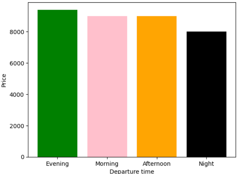
Figure 4 shows that the time of arrival of the people and we see that the evening flight fares are expensive at the arrival time also due to more demand and are the most convenient time to travel for most people.
To check the time of arrival according to price, we took the price and arrival time details and we found that here also evening departures are expensive.

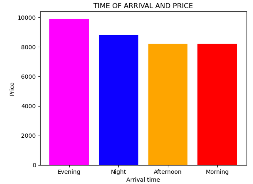
Figure 5 shows the number of stops and price. In this graph, we will see that the flights which have four stops are more expensive. As a direct/non-stop flight accounts for the fare of only one flight for a trip, its average fare is the least. As the no. of stops/layovers increase, the fare price goes up, accounting for no. of flights and due to other resources being used up for the same.
To check the total steps, we took the price and details of total steps and we found that the people who took 4 stops paid more as compared to others.

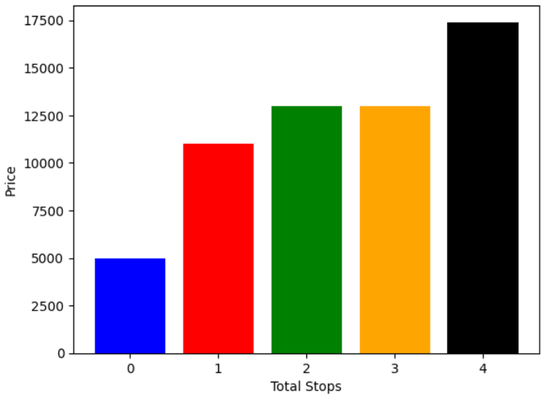
Figure 6 shows the pie chart of the destinations of the passengers, and we will find that various people are going to the Cochin state.
To check the destinations of the passengers, we took the details of the destination of passengers and we found that people visit Cochin state more as compared to others.

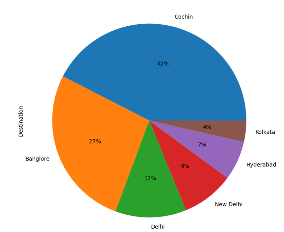
Figure 7 shows the pie chart of the source of the passengers, and we will find that various people are coming from the Delhi state.
To check the source of the passengers, we took the details of the source of passengers and we found that most of the people came from Delhi state.


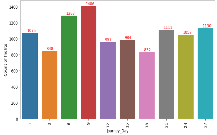
Figure 8 shows the count of flights with different dates. We found that most people travel at the beginning of the month.
Here we can see the count of people traveling in a month and we can predict the most travelled dates in a month.

After analyzing the data, we will find that the fare prices are highest in May, leading to high demand and hence high fare prices. The reason is the summer vacation of schools and colleges, which leads many families to go on vacations. Distance plays a significant role in ticket prices, so we can plan the holidays accordingly by checking the stops and layovers. Businesses can charge the passengers for the tickets by checking all the details.
Dataset:
You can download the dataset for practice by using the link below-
Data Fare-
After using the dataset and following the steps given above, you can easily make predictions by using the historical data.
Thank You and Happy Learning!
_edited_edited.png)

コメント