_edited_edited.png)
What is the Analytics Pane in Tableau?
The Analytics pane allows us to do the analysis of a data view. The analytics tools available in the analytic pane make data analysis much easier. In Tableau Public Analytic Pane is located at the top left of the authoring interface. We can toggle between the Data pane and the Analytics pane by clicking the tabs at the top of the sidebar. The Analytics pane provides drag-and-drop access for the various options. If an Analytic tool is grayed out in the Analytics pane, which means that the selected analytic object is not available for the current data visualization.
How to Add an analytics object
To add an analytic object to the view, drag and drop the required object from the analytics pane into the view. When you drag an item from the Analytics pane, Tableau shows the possible areas in the view for that item to drop. The destination in the view that an analytic object can be dropped depends on the available data and type of view. to
How to Remove an analytics object
To remove an item, Click on an analytic object that you want to remove and choose Remove from the tooltip. You can also perform UNDO to remove the analytics that you have added to the view.
How to Edit or Format an analytics object
To edit or format an item you have added from the Analytics pane, click on the item and select Edit or Format from the tooltip. For some items, you can do the editing and formatting by right click on the item and selecting edit or Format from the drop-down list.
The picture below shows the Analytics Pane in Tableau Public.

Sections in the Analytics Pane
The Analytics pane has three sections each providing different analytics visualization options for the data view.
1. Summarize Section
1.1 Constant Line
1.2 Average Line
1.3 Median with Quartiles
1.4 Box Plot
1.5 Totals
2. Model Section
2.1 Average with 95% CI
2.2 Median with 95% CI
2.3 Trend Line
2.4 Forecast
2.5 Cluster
3. Custom Section
3.1 Reference Line
3.2 Reference Band
3.3 Distribution Band
3.4 Box Plot
Summarize Section
Summarize section in the analytics pane gives 5 different data analytics views such as constant line, average line, median with quartiles, box plot, and totals. Let's understand each in detail.
Constant Line
Tableau Constant Line is used to add one or more constant lines to the view. You can add a constant line for a specific measure, for all measures, or for date dimensions. A constant Line has a constant value that can be set manually and it doesn't change. You can modify the appearance and behavior of the constant line by changing the Constant Line property values.
How to Add/Remove/Edit Constant Line in a view :
Now, let's discuss how we can add/ edit/ remove a Constant Line.
Step 1: In TableauPublic, connect to the Superstore data source (Source: www.kaggle.com ). Create a bar chart visualization of Region-wise Profit.

Step 2: From Analytics Pane drag and drop the constant line into the view.

Step 3: A Value Prompt will be displayed. Set the constant value manually inside the value prompt.

Step 4: Hit Enter once you set the constant value in the value prompt. The Constant Line will be created in the view.

Step 5: Click on the constant line, and a menu bar will be displayed which has options to Edit/Format/Remove the Constant Line.

Average Line
Tableau Average Line is a line to represent the data average of a given view. By default, average lines are visualized as a combination of the line value and the line title.
How to Add/Remove/Edit Average Line in a view :
Now, let's discuss how we can add/ edit/ remove an Average Line.
Step 1: In TableauPublic, connect to the Superstore data source (Source: www.kaggle.com ). Create a bar chart visualization of Category/Sub-Category wise Sales.

Step 2: From Analytics Pane drag the Average line into the view and hold it to see the different options available depending on what you have in your view. We can visualize the average Lines of the Table, per Pane, or per cell.

Step 3: Drag and drop the Average Line into Table to get the Average Line of the Entire view.

Step 4: Drag and drop the Average Line into Pane to get the Average Line per Pane. Similarly, drop the Average Line into Cell to get the Average Line per cell.

Step 5: Click on the Average line, and a menu bar will be displayed which has options to Edit/Format/Remove the Average Line.

Median with Quartiles
In Tableau Public, the Median with Quartiles object adds one or more sets of median lines and distribution bands to the view. The distribution bands are computed as quartiles that represent the 75th and 25th percentiles, and the distribution band spreads over the zone where 50% of the data falls in the view. The first quartile (Q1), represents the 25th percentile also known as the lower quartile. The second quartile (Q2), represents the 50th percentile called the Median or Middle quartile. The third Quartile (Q3), represents the 75th Percentile also known as the upper quartile.
How to Add/Remove/Edit Median with Quartiles in a view :
Now, let's discuss how we can add/ edit/ remove a Median with Quartiles Line.
step 1: In TableauPublic, connect to the Superstore data source (Source: www.kaggle.com ). Create a bar chart visualization of Region-wise Sales.

Step 2: Drag and drop the Median with Quartiles into Table to get the Median with distribution bands of the entire data. Here also you can see three levels of options (Table, pane, Cell) to view the median with distribution bands.

Step 3: The median with distribution bands (Covers 50% of data) of the view will be displayed.

Step 4: Click on either the upper quartile or lower quartile to edit/ format/remove the quartiles. Here I changed the fill color and Selected "Computation" from Label drop-down list to show the "upper quartile" and "Lower Quartile" text in the view. Then click "ok".

This visualization will be displayed after all the editing that I have done.

Step 5: Similarly, Click on the Median Line and a menu bar will be displayed to Edit/Format/Remove the Median from the view.

Box Plot
A Box plot (also known as Box and Whisker plot) is used to visualize the data distribution in a standardized way using 5 measurements ( minimum, Q1 (First Quartile), median (Q2), Q3(third Quartile), and maximum). Boxplots are also very beneficial when large numbers of data sets are involved or compared. You can add box plots for a specific measure or for all measures. Click any of the horizontal lines in the box plot to see statistical information about the whiskers, quartiles, and median. In the Box plot, Box represents the area where 50 % of the dataset lies. An outlier in a box plot is a value that lies in both the lower and upper extremes of data.
Let's understand the 5 measurements used in the box plot:

Minimum: The minimum value in the given dataset
First Quartile (Q1): The first quartile (lower quartile) shows the 25 percentile of data or it is the median of the lower half of data.
Median (Q2): The median is considered the second quartile. It represents the middle value of the dataset.
Third Quartile (Q3): The third quartile (upper quartile) shows the 75 percentile of data or it is the median of the upper half of the data.
Maximum: The maximum value in the given dataset.
Some other terms used in a Box Plot are:
Whisker: The lines extending from the box are called whiskers. There are two whisker lines called the lower whisker (line starting from the lower quartile(Q1)) and the upper whisker(line starting from the upper quartile(Q3)).
Interquartile Range (IQR): The difference between the third quartile and first quartile is known as the interquartile range (Q3-Q1).
Outlier: Value that lies outside the overall distribution pattern. Individual datasets beyond upper and lower whiskers.
How to Add/Remove/Edit Box Plot in a view :
Now, let's discuss how we can add/ edit/ remove a Box Plot.
Step 1: In TableauPublic, connect to the Superstore data source (Source: www.kaggle.com ). Drag Discount into rows.

Step 2: Drag and drop Subcategory into columns. The view shows the Subcategory wise Discount.

Step 3: In Analytics Pane, Drag and drop the Box plot into the view to get the Box Plot Representation of
Sub-Category wise Discount. Here we can analyze all five measures of the box plot.

Step 4: Click on the Box plot and Select the edit option to edit the box plot. Here, I changed the color of the box plot and I have checked the box to hide underlying marks except for outliers.

Step 5: Click OK when you are done editing. Here, we can see only outliers marks and the color of the Box Plot
has been changed.

Step 6: Click on the Box plot to see the options to Edit/Format/Remove the Box plot from the view.

Totals
The Totals under Summerize is a quick and easy way to find Sub-Totals, Column Grand Totals, or Row Grand Totals of a given view. We can use Totals to show views in both text and graphical format.
How to Add/Remove/Edit Totals as a text view :
Now, let's discuss how we can add/ edit/ remove a Constant Line.
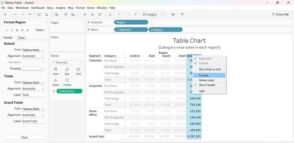
Step 1: Using a Sample superstore data source (Source: www.kaggle.com ) create a Table chart of the Category wise sales in each Region.

Step 2: In the Analytics tab select Totals from Summarize and drag it into the sheet. When dragging in Totals to a view I get the options to find Subtotals, Row Grand Totals, or Column Grand Totals.

Step 3: Drag and drop Totals in Subtotals to get the Subtotals (Here, we get Total Segment-wise sales in each region).

Step 4: Similarly drag and drop Totals to Row Grand Totals and Column Grand Totals to get the given below view. Row grand totals appear automatically on the right side of the visualization. Column grand totals appear automatically at the bottom of the visualization.

Step 5: To remove the Totals Analytics view from your table click on the item that you want to be removed. A message box will pop up, Then click "Remove" on the message box. (Here I removed the column Grand Totals)

Step 6: The Column Grand Total view has been removed from the Table chart. Similarly, you can remove the Row Grand Totals and Subtotals views.

Step 7: To edit the Totals text view, right-click on the Analytic Object(here, Column Grand Total) and do the required formatting. Similarly, you can edit the Subtotals and Row Grand Totals.
How to Add/Remove/Edit Totals as a Graphical view :
Step 1: Using Sample super store data source create a bar chart of Region-Category wise Sales chart.

Step 2: In the Analytics tab select Totals from Summarize and drag it into the sheet. When dragging in Totals to a view I get the options to find Subtotals, Row Grand Totals, or Column Grand Totals. In this Graphical view, we can select only Row Grand Totals (The other two options will be disabled).

Step 3: Drag and drop Totals in Row Grand Totals. (Here we get a graphical view of Category wise Total sales)

Step 4: To remove the Totals (here, Row Grand Totals) graphical view, click on the Grand Total, A message box will pop up, Then click "Remove" on the message box.

Step 5: To edit the Totals graphical view, right-click on the Analytic Object(here, Grand Total) and do the required formatting.

Please visit my Tableau Public Account to see the Story Visualization of all the Summarize Analytics :
In this blog, We have explored the Summarize section of the analytics pane with real-time scenarios. I will be discussing the other two sections (Model and Custom) of the Analytics pane in my upcoming blogs. This concludes my tutorial on Summarize section of Analytics Pane.