Introduction:
Data is everywhere, and with so much data being collected for analysis there should be a way to interpret data. To understand data in a better way, data visualization via maps or graphs gives us a better understanding. And it makes the human mind understand the data and identify the trends, patterns, or any analysis in a large dataset.
Bar Graph:
A Bar Graph is one of the easiest and most preferable charts among other charts. Bar Graphs are used by many visualization tools like Tableau, Power BI, Excel, etc. It is a method of presenting multiple attributes of data(Indratmo, Howorko, Boedianto, & Daniel, 2018). In the Bar Graph, the data is categorized visually in long vertical and horizontal bars. Levels are plotted on the X-axis and values are plotted on Y axis or vice versa.
Bar Graph visualization makes data easy to understand, one can easily understand the analysis. Also, it helps better in comparison. And it helps visualize large data to summarize easily.

Stacked Bar Graph:
Comparing data is the root of analysis, it's effective when it comes to visualization because while analyzing multiple attributes or categories of data, the user may need to focus on all categories. Stacked Bar Graphs are a visualization method for presenting multiple attributes of data(Indratmo et al., 2018). As learned earlier the bars can be either vertical or horizontal. The main difference between a bar graph and a stacked bar graph is stacked bar graph has one category axis and up to two numerical values. Stacked Bar Graphs are good when it comes to representing totals.

Objective:
In this blog, I’m creating a bar graph using sales data to view sales by month and a stacked bar graph to see the total sales and profit.
1. Open Tableau Public

2. Get the datasheet from your local drive

3. Drag the tables and create connections

4. Click on Sheet 1, as we see all the tables are listed on left and visualization appears on right

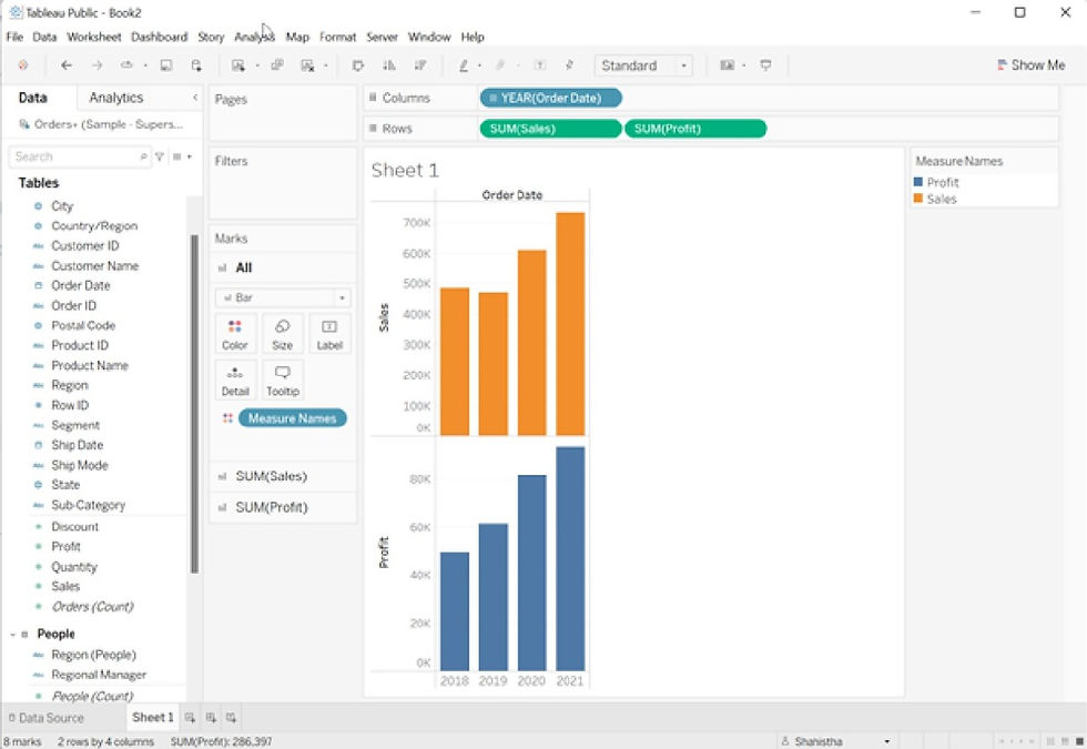
5. Drag Sales to Rows, Tableau gives visualization by default in a bar graph or line graph

6. Drag OrderDate in columns, I want to visualize by year

7. Drag and drop the OrderDate in Color under Marks, to define differentiation.

For Stacked Bar Graph:
1. In the Bar Graph above drag and drop the profit table on rows

2. Click on the dropdown from the profit chart and click on Dual Axis

3. Here is a stacked bar graph

4. To get better visualization, drag profit and drop it in color, size, and label under marks.

Conclusion:
Build up a Bar graph and stacked bar graph for a crisp and easy understanding of your data. Thank you for reading my blog. Claps are requested for appreciation.
References:
Indratmo, Howorko, Lee, Boedianto, Joyce Maria, & Daniel, Ben. (2018). The efficacy of stacked Bar Graphs in supporting single-attribute and overall-attribute comparisons. Visual Informatics, 2(3), 155-165. doi:https://doi.org/10.1016/j.visinf.2018.09.002
_edited_edited.png)