Data visualization is the practice of translating information into a visual context, such as a map, chart or a graph, to make data easier for the human brain to understand and pull insights from. The main goal of data visualization is to make it easier to identify patterns, trends and outliers in large data sets.
Control Chart is a chart which uses standard deviations above and below the mean. Standard deviation is used to show how far the data is from the mean. Therefore, the measure of standard deviation is often used to identify outliers/spikes in the data for the further analysis. The band width in the control chart around the mean can be multiples of standard deviation.
In the below example I have used Walmart sales data looking at profit for each order date. I have also shown how to create a calculated field for Average, Upper control Limit (UCL) and Lower Control limit(LCL) and a control parameter which allows the user to adjust the standard deviation whenever necessary.
Step1: Create a basic Bar chart
First, we will build out the foundation of the graph. Start by right-clicking and dragging Ship Date onto the columns shelf, this will build the X-axis of the chart and then selecting profit to the Rows.(this will default to SUM, which is what we want)

Under marks change the bar to Circle.

Step2: create three calculated fields for the Average, UCL and LCL.
Average Line –The average value of the data set
Upper Control Limit – The calculated value of the maximum in-control value
Lower Control Limit – The calculated value of the minimum in-control value

Click the drop down arrow near the search bar, Click in the create calculated Field


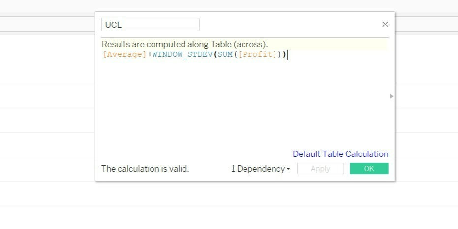
UCL and LCL acts as the Upper and Lower control Limits. They use formula but remember to have the correct + and – in the middle for upper and lower: [ Average ]+ or - WINDOW_STDEV(SUM(Profit)).
Step 3: Add a Reference line for the calculated fields.
To be able to use the calculated fields, they need to be in the view, i.e. on a shelf, so drag these to the details shelf on the marks card. Now Right click on the profit axis and go to add reference line

Right Click on the Profit axis, then click on the Add Reference line.

Edit the reference line per pane for the Average.

Choose the band and edit the UCL and LCL per pane.
You will observe a dark straight line for the Average and two dotted lines for the UCL and LCL.
Step 5: Distinguishing the outliers by adding color to the Chart
Create a calculated field to create Color Label

Add the Color Label into the Color under Marks card.

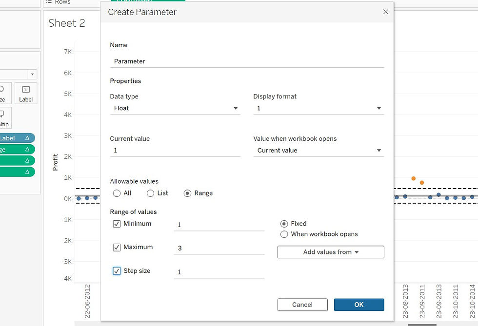
Step 7: Create a parameter:
The parameter will interact with the UCL and LCL.


Now go and include the parameter in the UCL and LCL
The formula is[Average]+ [Parameter ]* WINDOW_STDEV(SUM([Profit])) and [Average]-[Parameter ]* WINDOW_STDEV(SUM([Profit])).
Conclusion: Control charts are a great way to show significant outliers from the average results in the data set.
_edited_edited.png)