STEP 1: Imports and reading data
When working with Python, importing libraries is essential for extending the functionality of your code. The most common way to import a library is by using the Import statement followed by the name of the library. You can also use aliases to make library names shorter. Below are the required libraries along with their descriptions.
import numpy as npimport pandas as pdfrom matplotlib import pyplot as plt plt.style.use('ggplot')import seaborn as sns pd.set_option('display.max_rows',None) # shows all the rowspd.set_option('display.max_columns',None) # shows all the column namesPython is capable of reading the most popular file formats. Here, a CSV file is being read.
df = pd.read_csv('filename.csv')df = pd.read_excel(r"file path",sheet_name=0)STEP 2: Data Understanding
Understanding data is vital because it allows for informed decision-making and highlights the data’s strengths. It enhances data quality and guarantees precise and dependable outcomes. Grasping the data is essential for pinpointing issues that may arise before and throughout the analysis.
Data frame shape
The shape of a Data Frame in Python (specifically using the Pandas library) refers to the dimensions of the Data Frame. It provides information about the number of rows and columns in the Data Frame.
For example, if a Data Frame has a shape of (80,10), it means the DataFrame contains 80 rows and 10 columns of data.
df.shapeHead and Tail Function
The head() function displays the top 5 rows of a DataFrame.
It’s useful when dealing with large datasets, allowing you to get a quick overview.
The tail() function shows the bottom 5 rows of a DataFrame.
Useful for quickly checking the end of the dataset.
df.head(10) # display the first 10 rows of data Frame
df.tail()   # display the Last 5 rows of data Frame
These are the general steps applicable to any dataset. Now, let’s examine a specific dataset to gain a concrete understanding of the subsequent steps.
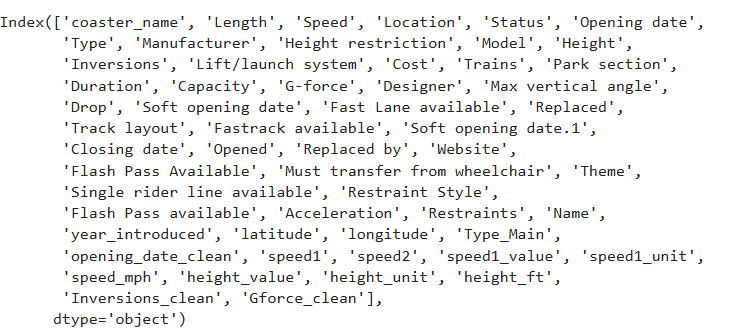
Having read the Roller Coaster Dataset as per the previous step, the dataframe consists of 1087 rows and 56 columns. To list the names of the column using
df.columnsdtypes
This helps to identify the data types for each column.
df.dtypesdescribe
To generate a summary of descriptive statistics for each numeric column in a DataFrame, utilize the ‘describe’ function. For categorical columns, include the parameter ‘include=all’ to ensure the function is applied to these as well.
df.describe
df.describe(include='all')
STEP 3: Data Preparation
Dropping Irrelevant columns and Identifying Duplicate columns
The most critical step involves selecting features that align with the project’s objectives or goals. Now, let’s remove the irrelevant columns using two methods.
# Example of dropping columns
df.drop(['Opening date'],axis=1)
You can use the df.drop() method to remove columns if the dataset is not wide. Alternatively, if you have a wide dataset, you may consider using the method outlined below to drop the columns.
# Choosing the relevant column and dropping the remaining column for analysis
# feature selection and saving as .copy()
df= df[['coaster_name','Location', 'Status', 'Manufacturer',
        'year_introduced', 'latitude', 'longitude',
        'Type_Main','opening_date_clean', 'speed_mph',
        'height_ft','Inversions_clean', 'Gforce_clean']].copy()
Changing the datatypes
Since the date column is the object data type, you can convert it using the function below.
 # changing the date column from object data type to date time data type
df['opening_date_clean']= pd.to_datetime(df['opening_date_clean'])
# changing the string dtype to numeric
pd.to_numeric(df['Year_introduced'])
Renaming the column Names
Column names can be renamed using a dictionary that maps old names to new ones.
# Renaming the column Names
df=df.rename(columns={'coaster_name':'Coaster_Name',
                       'year_introduced':'Year_Introduced',
                       'opening_date_clean':'Opening_Date',
                       'speed_mph':'Speed_mph',
                       'height_ft':'Height_ft',
                       'Inversions_clean':'Inversions',
                       'Gforce_clean':'Gforce'})
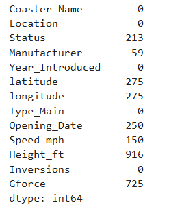
Check for missing values
df.isna().sum()
Check for duplicate rows
The command df.loc[df.duplicated()] is utilized to identify and filter out duplicate rows in a DataFrame, marking all duplicates as True except for the first occurrence.
# check for duplicate with coster namedf.loc[df.duplicated(subset=['Coaster_Name'])].shape# check for duliplicate with all three columns and sum the number of rowsdf.duplicated(subset=['Coaster_Name','Location','Opening_Date']).sum()The df.drop_duplicates() method in pandas is used to remove duplicate rows from a DataFrame.
# Drop the duplicate rows df=df.loc[~df.duplicated(subset['Coaster_Name','Location','Opening_Date']]
    .reset_index(drop=True).copy()
.reset_index(drop=True).copy():
After filtering, the .reset_index(drop=True) part resets the index of the resulting DataFrame, dropping the old index. The .copy() method creates a new copy of the DataFrame to avoid modifying the original.
STEP 4: Feature Understanding (Univariate analysis)
Plotting Feature Distributions Histogram KDE Boxplot.
This is the most important step in understanding the distribution of values and finding potential outliers.
use value_counts() to count unique combinations of values across specified columns.
ax = df['Year_Introduced'].value_counts() \
    .head(10) \
    .plot(kind='bar', title='Top 10 Years Coasters Introduced')
ax.set_xlabel('Year Introduced')
ax.set_ylabel('Count')
Histograms are used to analyze the distribution of coaster speed by displaying the range of speeds and their corresponding frequencies.
ax = df['Speed_mph'].plot(kind='hist',
                          bins=20,
                          title='Coaster Speed (mph)')
ax.set_xlabel('Speed (mph)')
# This histogram will help to understand the vaule distribution for each
# features
ax = df['Speed_mph'].plot(kind='kde',title='Coaster Speed (mph)')ax.set_xlabel('Speed (mph)'The KDE Kernel Density Estimation plot estimates the data's probability density function, showing the coaster speed distribution.
STEP 5: Feature Relationships (Bivariate analysis and Multivariate analysis)
Scatterplot
A scatter plot (also known as a scatter chart, scatter graph, or scattergram) is a type of graph used to visualize the relationship between two variables.
df.plot(kind='scatter',
        x='Speed_mph',
        y='Height_ft',
        title='Coaster Speed vs. Height')
plt.show()
Pairplot
A pair plot (or scatterplot matrix) is a data visualization technique used to explore relationships between multiple variables in a dataset.
sns.pairplot(df,
             vars=['Year_Introduced','Speed_mph',
                   'Height_ft','Inversions','Gforce'],
            hue='Type_Main')
plt.show()
Heatmap Correlation
A correlation heatmap is a graphical representation used to visualize the relationship between multiple variables in a dataset.
# Drop the null values to find the correlation of these columns
df_corr = df[['Year_Introduced','Speed_mph',
    'Height_ft','Inversions','Gforce']].dropna().corr()
df_corr
The speed of a roller coaster is positively correlated with its height and the G-force.
STEP 6: Ask a Question about the data
Try to ask a Question about the data and answer the question using a plot or statistics.
For example
Which locations have the top 10 fastest roller coasters in the world?
# check the column Location and calculate the counts of each value df['Location'].value_counts()
# select the columns which are not equal to 'other'and Group the average
# speed of each location and count them
ax = df.query('Location != "Other"') \
.groupby('Location')['Speed_mph'] \
.agg(['mean','count'])# Get the count greather than 10, sort the values to plot the horizontal
# bar graph
ax = df.query('Location != "Other"') \
    .groupby('Location')['Speed_mph'] \
.agg(['mean','count']) \
.query('count >= 10') \
.sort_values('mean')['mean'] \
.plot(kind='barh', figsize=(12, 5), title='Average Coast Speed by Location')
ax.set_xlabel('Average Coaster Speed')
plt.show()Summary
EDA (Exploratory Data Analysis) is a critical step in data analysis that involves examining and visualizing data to identify patterns, trends, and relationships that can provide insight into the data and guide further analysis. Here are the general steps involved in the EDA process:
Data Collection: The first step in EDA is to collect the relevant data from different sources, such as databases, APIs, or flat files.
Data Cleaning: After collecting the data, it needs to be cleaned by removing any missing values, duplicates, or outliers.
Data Visualization: Once the data has been cleaned, it is visualized using various techniques such as histograms, scatter plots, box plots, and heatmaps to identify patterns, trends, and outliers.
Data Analysis: After visualizing the data, statistical analysis is performed to understand the relationships between different variables, such as correlation, regression, or clustering.
Interpretation and Communication: Finally, the results of the analysis are interpreted and communicated to stakeholders using various tools and techniques, such as reports, dashboards, or interactive visualizations.
Conclusion
Overall, the EDA process provides a powerful way to explore and understand data, identify patterns and relationships, and communicate insights to stakeholders. It is an iterative process that involves continuous exploration and refinement of the data to gain deeper insights and understanding.
_edited_edited.png)


